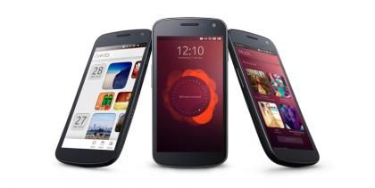
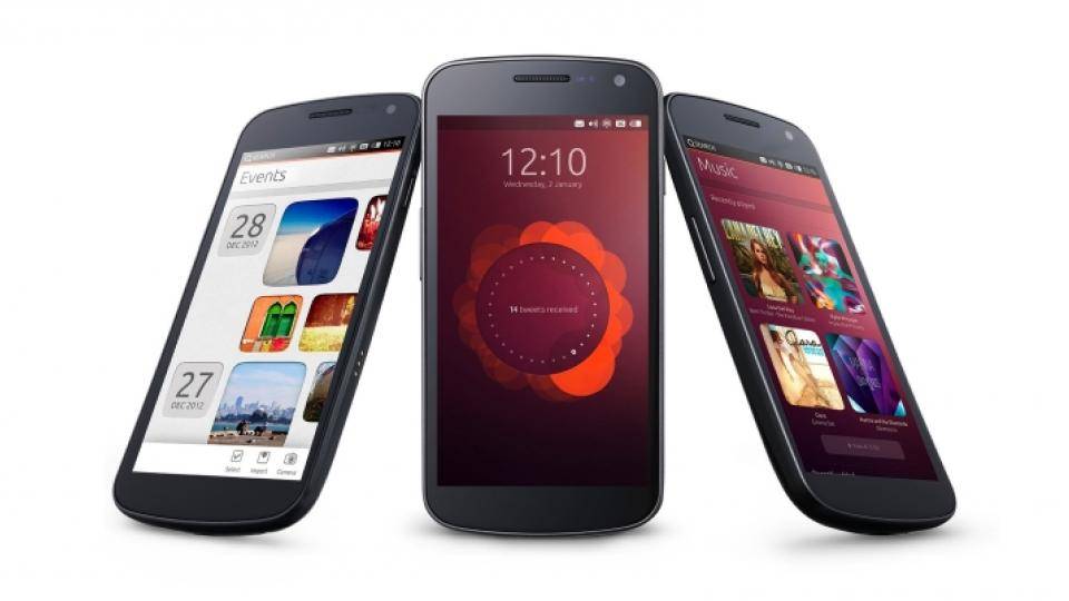
Canonical was at Mobile World Congress 2014, showing off the latest builds of its Ubuntu smartphone operating system.
Smartphones running Ubuntu are finally set to hit the market this year, as Canonical has signed deals with Spain's BQ and China's Meizu to produce the first phones – the Aquaris and the MX3.
There's no word on exactly when the phones will be released or whether they will come to the UK, and at MWC they were locked in a glass cabinet, so we played with the latest version of the operating system on one of Canonical's test Google Nexus 4 handsets.

UBUNTU FOR PHONES INTERFACE
Canonical has been keen to differentiate Ubuntu from other smartphone operating systems, and it takes a bit of time to get used to using Ubuntu on a phone. Your first obstacle is that there aren’t any buttons under the screen. For those used to tapping to go back or to the home screen, you can feel a little lost, but Ubuntu is all about the gestures.
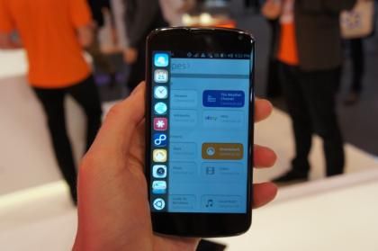
There is a different gesture for each side of the screen. Swiping in from the left brings up the vertical app launcher, complete with your favourite apps, which resembles the launcher in the desktop version of Ubuntu. Swiping in quickly from the right swaps between apps, while swiping in slowly brings up a 3D tiled view of all open apps, so you can flick through and choose the one you want.

Swipe from the left to see the launcher with your favourite apps
Swiping in from the bottom brings up a context-sensitive menu, which differs depending on what app you're running. Finally, you have the top-swipe menu, which is common across all apps. This is a little more versatile than Android's notification bar; it consists of several sub-menus which you flick through, each with its own set of options and information. The names of the sub-sections are listed at the top, and as you swipe between network settings, messages and notifications, for example, the part just below changes accordingly. It's a neat way to have access to a large number of different phone functions from a single place.
UBUNTU FOR PHONES APPS
You can access your most-used apps from the launcher, but there's also a standard app view. This shows your apps as cards, and lets you close them down manually.
This is a fairly standard arrangement, but what's particularly interesting is the way that the local and online app views are merged; below your installed apps is another section showing apps available for download. This hybrid local/online approach carries over to other apps, too. The music player, for example, is also split into on and offline, so when you search for a song it is shown on your device alongside songs available for purchase online.
UBUNTU FOR PHONES DESIGN
Canonical was keen to stress that Ubuntu would not get bogged down from having too many apps open, and that you won't have to go through the tedious rigmarole of closing down apps manually. This is due to the way the system manages resources; apps that aren’t currently in the foreground exist in a frozen state, so don’t take up any processor cycles. If an app needs to be doing something while you're using a different app, such as a music player continuing to play music while you surf the web, that app will be able to hand off that aspect of its functionality to the system before going into a frozen state. This should help to keep the operating system running smoothly on the medium-to-high specification phones for which Ubuntu is designed.

