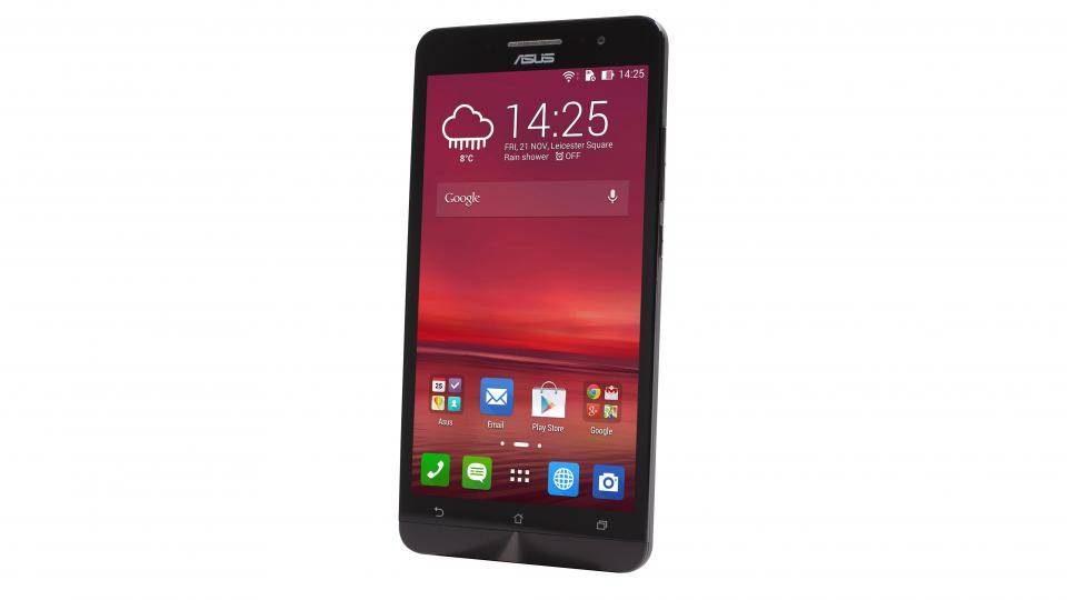
Until recently, large screen phablet phones were dominated by a single handset: the Galaxy Note 4. The Nexus 6 went even larger with a 6in screen for £100 less, but its lack of phablet-specific features in Android 5.0 Lollipop and rather average battery life meant it couldn't best Samsung's phablet king. The Asus Zenfone 6 is larger still, measuring a massive 167x84x9.9mm and weighing a hefty 196g, but unlike its premium rivals, it costs just £240 SIM-free and has plenty of useful features to help make it an attractive alternative for those on a budget.
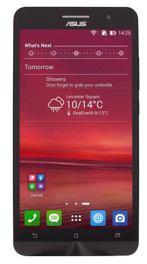
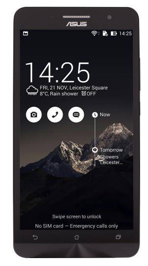
A large part of this is down to Zen UI, which runs on top of the Android 4.4.2 operating system. The home screen feels like the default Android interface, but the lock screen shows a lot more information than either the Nexus 6 or the Galaxy Note 4. As much as we like Android 5.0 Lollipop's actionable lock screen notifications, the Zenfone 6 shows you the weather forecast and your upcoming calendar appointments, as well as shortcuts to the camera, dialler and messages.

This gives you a useful overview of your day as soon as your turn on the screen, and you can even set countdown reminders so you know how much time you've got left before your next meeting. You'll still need to unlock the phone and tap the respective widget to interact with your calendar, but being able to see what's coming up at a glance is better than unlocking and swiping through multiple home screens.
The Zenfone 6's sheer size won't appeal to everyone, though, as it's even taller and wider than the Nexus 6, which was already quite a handful. The slightly thicker sides provide a lot more purchase than the thin, tapered edges of the Nexus 6, though, making it easier to grip while still sitting comfortably in your hand. The screen bezels are still comparatively chunky compared to other phablets, but this is to be expected on a mid-range device.

The large 6in screen looks pleasantly detailed at first glance, despite the 1,280x720 resolution. Compared to Samsung and Google's top-end phablets, the Zenfone 6's pixel density of 244 pixels-per-inch is pitifully low compared to the 515PPI Note 4 and 489PPI Nexus 6. Slightly fractured, jagged edges creep in on the weather widget and certain letters on the main home screen, suggesting 1,280x720 doesn't provide enough pixel definition for such a large screen. However, most app icons still looked sharp and crisp, and the vast majority of text was perfectly legible.
On closer inspection, image quality isn't as good as we might have hoped, as our colour calibrator showed it was only displaying 86.4 per cent of the sRGB colour gamut. This is lower than we'd normally expect from a phone of this price and its red, magenta and green coverage was particularly short. This made images appear rather cool and lacking definition, with whites appearing noticeably grey. The rather low peak brightness level of just 273.19cd/m2 didn’t help this, but at least blacks were reasonably deep, measuring 0.27cd/m2. A contrast ratio of 997:1 was decent, too, producing wide viewing angles and lots of onscreen detail.

