Long gone are the days of the $199 Moto X , but with each price bump comes major improvements. Today, Motorola’s unveiled its most powerful Android phone yet: The Moto X Style .
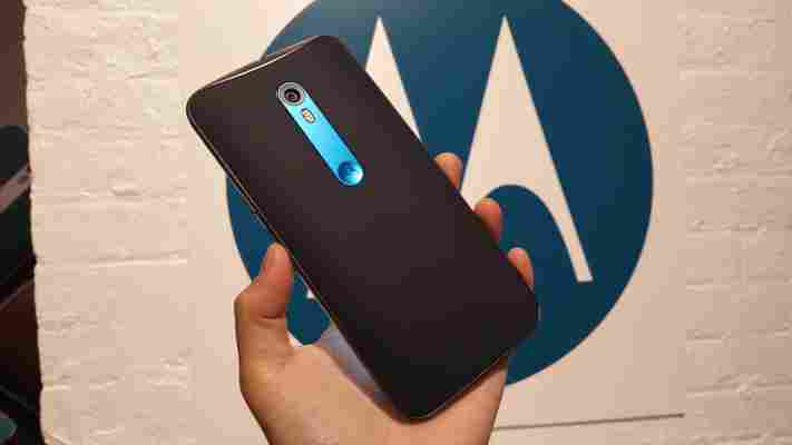
If you’ll excuse the Taylor Swift-ified name, the Moto X Style is jam-packed with impressive specs: 1.8GHz hexa-core Snapdragon 808 processor, 3GB of RAM, 16GB of memory, a microSD slot and a whopping 21MP rear camera. As we’ve come to know about Moto phones, the pure Android processing speed is snappy, and Moto Assist, Moto Display and Moto Actions are all there to help with hands-free interactions.
It was refreshing to see Motorola work on what seemed to be lacking most last year : the camera. In our hands on with the device, you can see immediate improvements over the second-gen Moto X. The Moto X Style’s camera loads up in nanoseconds, and captures more light than my trusty Samsung Note 4.
Holding the two phones side by side, Moto X Style offers a more even white balance and takes a brighter photo under low light conditions. With flash, Moto X Style also has a warmer tone than the Samsung Galaxy S6 conveniently placed next to it on the show floor.
Although I thought the ring flash from last Moto X’s model was unique, it just didn’t offer even lighting in darker scenarios. I do appreciate that Moto X Style’s got a front-facing flash now, too, though.
One thing I still hate about Motorola’s default camera configuration is the tap to take photos feature. I understand it’s meant to help with speediness, but it doesn’t let you properly focus on the object. And with that, image stabilization is still an issue, which is a shame as all the megapixels in the world can’t help with blurry photos.
At 5.7-inch, this thing is a behemoth. It’s slightly smaller than the Note 4 and looks like a baby compared to the Nexus 6, so it’s not quite a phablet, but it sure is crossing that line.
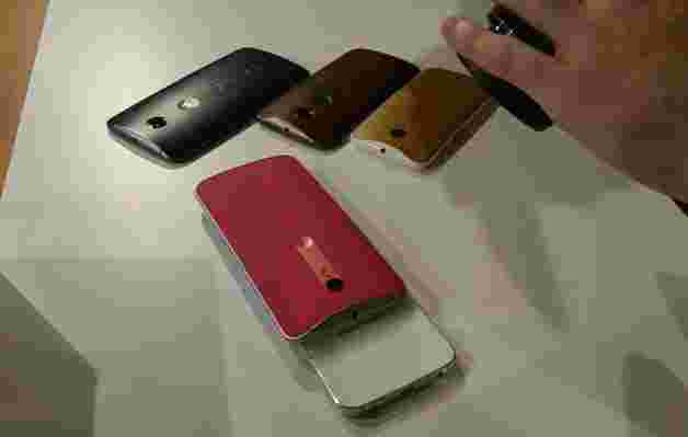
With customizable backs, however, the device is nicer to hold since you can select different materials to help improve grip and avoid the cheap, plastic-y feel. Admittedly, I do miss the sturdiness of a brushed metal finish.

On the display end, the Moto X Style’s Quad HD screen offers a crisp, beautiful imaging. Sadly, unlike its budget counterpart , it’s not waterproof – which would have made the device killer.
We weren’t able to test battery life at the hands on station, but it still doesn’t have removable battery (if that’s your thing). With a 3,000mAH battery and TurboPower charging that can replete up to 10 hours of life in 15 minutes, however, you probably won’t need to worry about replacements.
At $399 for an unlocked Android device, purists should be very happy with the Moto X Style when it launches in the US this September on Motorolaom, Best Buy and Amazon.
It’ll be interesting to see how this goes against the freshly-announced OnePlus 2 , but given the Moto X won’t require an invite to buy , we wouldn’t be surprised to see more customers drop the extra $70 to avoid the wait time.
Read next: Meet the $180 Moto G, Motorola’s newest budget Android phone
Wow, this Android phone is stupid cheap
Sometimes you’re in the market for a super cheap phone. Whether you’re just looking for a stopgap replacement, a backup or a burner, having a cheap and cheerful smartphone around is something worth considering.
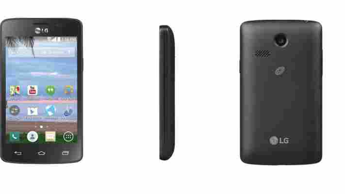
Today, Motherboard spotted a TracFone on WalMart’s website, developed in partnership with LG, that has pushed the price of an Android smartphone down to less than $10.
$10! Depending on where you live, that’s less than a lunch at your favorite restaurant.
Of course, a smartphone this cheap isn’t anywhere close to cutting edge. It runs on Android KitKat — a couple of OS updates behind and a far cry from the current Marshmallow — and will probably never be able to upgrade.
It has a 3.8″ touchscreen display that is lacking any visual bells and whistles. But it does have a (3 megapixel) camera and functional Bluetooth, so you can definitely do smartphone things with it. Capable of 3G (but not LTE), the phone has a 4GB microSD slot that can be expandable, so there’s hope to upgrade from the initial poor storage found in the phone for a few bucks extra.
Did we mention it costs less than $10?
Currently, the phone is sold out, so you’ll have to be diligent at your local store or pick it up when it goes back on sale. It’s not the prettiest, most advanced or most secure phone, but it’s dirt cheap. Sometimes, that’s all you need.
➤ Walmart’s $10 Smartphone Has Better Specs Than the Original iPhone [Motherboard]
Sonos’ all-new Play:5 is loud, beautiful and serious about great sound
When I first discovered the Sonos system last year , I couldn’t believe what I had been missing out on. All it takes is a few speakers to get high-quality music, from any service, in each room of your house.
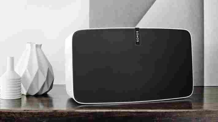
Sonos is taking the wraps off its all-new Play:5 speaker today, which is the first time the largest speaker in the company’s lineup has been updated.
Earlier this month, Sonos showed off the new hardware in an Amsterdam apartment and I was blown away by the improvements its made in its latest speaker.
The new Play:5 features six drivers, three mid-woofers and three tweeters packed into a sleek new design that makes the old speaker appear dated. Instead of the physical volume controls on top, Sonos opted for capacitive touch buttons that are much easier to press.
The updated speaker is particularly interesting because it can be used in three orientations. It can lie horizontally, stand on its end or be paired horizontally to create stereo audio — Sonos’ team told me that ensuring it works consistently in all three was something of a challenge that it spent a lot of time on.
To pair the new Play:5, there’s a sync button nestled in the back of the speaker, next to the line-in port which Sonos opted to keep around. The sync button will be standard fare for future hardware, so there’ll be no more awkward pressing of the play and volume buttons to try and connect.
Sonos also developed a new software feature called TruePlay that automatically accounts for the acoustics of your room and adjusts the speaker’s EQ settings for best sound.
I’ve got the first generation Play:5 and this new version’s sound is a stark difference from the old: it’s crisper, offers an insane amount of bass and can be turned up to wall-shakingly loud volumes. At the demonstration in Amsterdam, it was unbelievable how loud the speakers could go without distortion — enough to annoy even your most distant neighbors.
Design-wise it’s a huge leap forward from the original Play:5, which was Sonos’ first ever speaker. It looks even better in person, and now I’ve got to find a reason to buy another speaker.
The second-generation Play:5 will be available in matte black or matte white. It’ll retail for $499 USD, $549 CAD, $749 AUS, €579 and £429 when it becomes available later this year — Sonos didn’t give a specific date for when you’ll be able to purchase it.
For now, enjoy this gratuitious gallery of the new Play:5.
