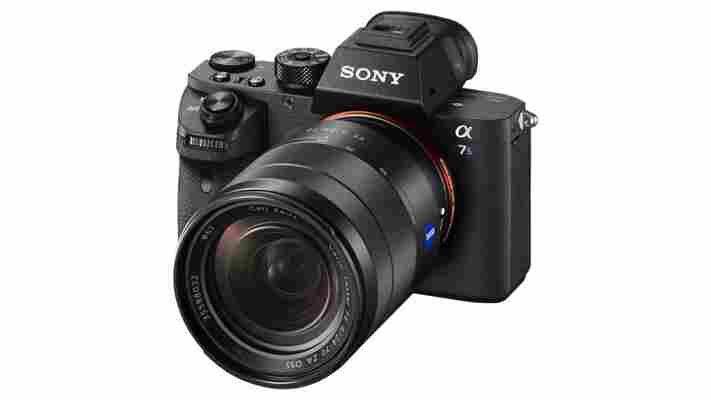
Sony has a new camera that can see in near pitch-black light – and record it in 4k without any additional gear.

The company today announced the A7S II, the successor to the A7S . The original A7S was lauded as the best low-light camera on the market after having been designed specifically for that purpose.
While the ridiculous ISO 50-409,600 range hasn’t been changed, Sony says the camera will produce less noise than the original A7S.
Here’s a demo of that performance, where Sony shows off how the camera can practically make nighttime look like a cloudy afternoon:
Perhaps more importantly, the A7S II has a few important features that will make a big difference for photographers and videographers alike.
First off, the camera now has the excellent 5-axis in-body image stabilization (IBIS) introduced for its cheaper A7 II sibling, which will work with any lens you attach to the camera.
Sony rates the stabilization to be effective to 4.5 stops of light; that means you can shoot handheld photos at much lower shutter speeds than possible before, which can improve your low light photos significantly for static subjects.
It also improves performance when using telephoto or zoom lenses, and makes video appear much smoother during motion. It virtually eliminates the need for an external stabilizing system for small movements, meaning videographers have to pack less gear.
While original A7S was the first full-frame camera that could shoot in 4K, only 1080p content could be saved internally; you had to connect an external rig to any 4k video. That was was fine for a lot of high budget professional work but not ideal for run-and-gun type filming you’d want from such a small camera body.
With the A7S II, 4K video can now be saved internally. Video is now saved at a higher 100Mbps bitrate and with full-pixel readout (meaning sharper video). The camera also now shoots at up to 120fps in 1080p, which allows video to be slowed down in-camera five times over the standard 24 frames per second.
These changes should all amount to a much more powerful tool for the on-the-go-videographers, allowing them to shoot professional quality low-light video in 4K without the need for any external gear in some instances.
Other new features include what Sony is calling the world’s largest full-frame viewfinder, improved autofocus system (especially in low light video), and a slew of new codec options for professionals.
Estimated to be around $3,000 when it launches in October, it won’t exactly be cheap, but it’s still much more affordable than many professional or semi-professional video cameras that offer similar or less features and image quality.
There also isn’t really anything else like it on the market at the moment; the closest competitor is the Panasonic GH4 , which is a lot cheaper and has its own set of unique features, but also is not in the same class for low light imaging.
Given how small the package is now that you don’t have to carry stabilization gear or an external storage unit, the A7S II will likely be very popular among budding videographers and professionals on-the-go alike.
➤ Sony expands range of compact full-frame mirrorless cameras with the launch of the ultra-sensitive α7S II [Sony]
First impressions: Punkt’s distraction-free designer phone feels like it’s punking me
As someone who spends a disproportionate amount of my life sat at a computer, it’s easy to get sucked into checking out every link, every article, every email – every everything that lands in front of me. And if that happens, not a lot else gets done in a day.

It’s equally easy after forming habits like that to carry them on from your phone during the fleeting moments you’re not sat in front of your screen.
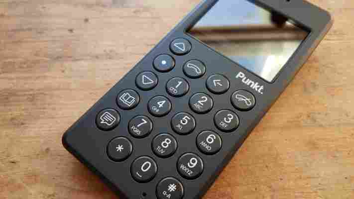
If that sounds all too familiar, then you’re exactly the sort of customer Punkt is aiming its first ‘distraction-free’ device at – the MP01 .
In a nutshell, it’s a stripped back device that lets you call, text, set a reminder or set an alarm. That really is about it.
Oh, there is a really basic calendar too.
After spending a little time with the MP01, I’ve come to appreciate the unusual design elements – it has a more angular back than most devices, for example. I also love how the ‘back’ button isn’t placed next to the buttons for controlling up and down navigation, as would often be the default – instead it’s placed where your hand seems to naturally go.
It’s also nice to have buttons that let you jump straight to your phone book or writing a message; it’s certainly a device that wants to spend most of its time in your pocket, bag or anywhere else out of use.
However, I can’t help but feel that while the problem is a genuine one – ‘digital distraction’, despite being a terrible term is real – the MP01 doesn’t quite strike the right balance as a solution.
Primarily, for this deliberately limited functionality you’ll need to pay $299, which feels like an awful lot of money when you can pick up a basic no-frills handset from eBay for around $20 .
Sure, I like the nostalgia of a T9 keyboard as much as the next person, but do I really want to pay $300 for that privilege? Hell, no.
It’s an undeniably distinctive design that was well thought through in hardware terms – as it should be, having been designed by British designer Jasper Morrison. While the software won’t seem all that familiar to anyone used to a smartphone, it’s intuitive and takes only a few minutes to get your head around how to navigate.
The best part about it is probably the battery life; I noticed it was showing red and nearly fully depleted then forgot to turn it off – two days later it was still powered on.
However, whether it’s worth the not inconsiderable $300 asking price depends on how sensitive your design tastes are and just how badly you want to cut back on notifications on your phone – alternatively, you could install something like ClearLock to cut back on interruptions .
Appealing as the hardware is, it’s just too expensive for me.
➤ Punkt
If you think the Apple Watch is unintuitive you should watch this iPhone introduction
My Apple Watch arrived three weeks ago and I still struggle with it sometimes. I’ll try to access the ‘glances’ from within an app (not possible), try a Force Touch ‘deep press’ only to be met with a Watch shake (the equivalent of an alert sound on the Mac), or try the Digital Crown on interfaces where there’s nothing to scroll.

So yeah, there’s a learning curve to the Apple Watch.
I’m also unsure what to demo when people ask me why they should get one. There are about 20 reasons why the Apple Watch is cool, useful or even unmatched. But I can’t name one ‘killer app’ that really sells it.
In other words: it is pretty much the same experience as we all had with the first iPhone.
This is, apparently, not how a lot of people remember it. I’ve read reviews of people who said the Apple Watch isn’t anywhere as intuitive as the iPhone. But that’s really not true. When the iPhone first came out it was revolutionary and all the things we now take for granted were amazing but sometimes confusing at first.
Check out the original iPhone introduction below and see how thrilled and amazed and surprised people were when Jobs talks about simple things like scrolling, or pinch-to-zoom. And then remember how this first iPhone didn’t have copy-and-pasting yet, or even an App store.
I remember vividly explaining to people how easy it was to edit text, zoom in, scroll, move apps around or even delete them for years. I still meet people who don’t know they can easily switch between apps by double clicking the home button. Or that you can kill an app by double clicking and then swiping up.
Yes, the Apple Watch is new, and some things take some time to get used to. But that isn’t new for Apple products, and it certainly isn’t a bad thing.
[interaction id=”556c1c8f84caec334b12fdc1″]
Read next: Apple says Watch OS 1.0.1 records heart rate irregularly on purpose. Thanks, Apple
