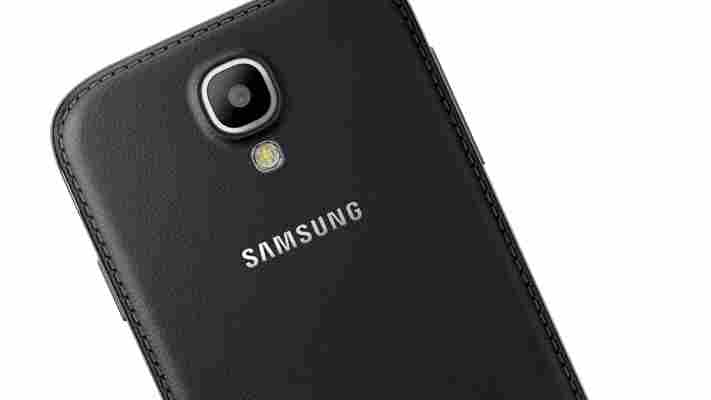
It was spotted on Samsung’s Russian website last week, but now it’s official. Samsung is launching a ‘Black Edition’ Galaxy S4 and Galaxy S4 Mini later this month, sporting a faux leather back panel similar to the Galaxy Note 3.

On the specs side, it looks like Samsung hasn’t changed anything for either device. They will, however, come with a series of exclusive wallpapers and ringtones – which we doubt many people will care about – as well as a ‘Black Edition’ power adapter, data cable and headphones.
Samsung refrained from offering any details about the price or international availability of the handset, however.
The release is timely given that Samsung is expected to announce the successor to the Galaxy S4, likely called the Galaxy S5, later this month at Mobile World Congress. Will Samsung ditch the glossy plastic back entirely for its next flagship Android smartphone? It seems increasingly likely.
➤ Press Release
Evernote and Moleskine’s new business notebook gives you more ways to share and organize pages
I’ve tried going digital-only for all off my note-taking needs, but in the end I always revert back to pen. It’s the physical act of writing something down that helps me to remember.

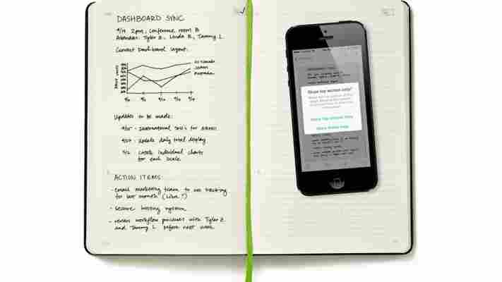
Evernote tackled the problem over a year ago by developing ‘ Smart Notebooks ‘ with Moleskine. Now it’s back with an upgrade for enterprise customers, aptly called the ‘Evernote Business Notebook’. The key difference is that each page is separated into different sections, giving you the option to share only a part of your handwritten notes with other people.
In practise, this means each sheet of paper is divided into an upper and lower quadrant. The bottom section is envisioned as a personal crib sheet, where you can write anything without the fear of any prying eyes. Once you’ve recorded the page with the Evernote app, the service will ask whether you want to share only the top section. Recipients receive only the upper quadrant, while the full note is safely stored in your account.
As before, all of the notes that you jot down in the Evernote Business Notebook are searchable. No matter how poor your handwriting is, Evernote should be able to discern the words and surface them appropriately when you search for them in any of its regular note-taking and productivity apps.
The original Evernote Smart Notebook took advantage of colorful stickers to help you catalog notes with custom tags and rules. The business edition retains those features while adding a new reminder icon to the top of each page. Add a quick ‘tick’ and Evernote will remember to add the note to the top of your list in the dedicated reminders section.
The Evernote Business Notebook will be sold for $32.95 through Evernote Market, which isn’t cheap. For enterprise customers though, that could be a small price to pay for stress-free note-taking. Evernote for iPhone and iPad already supports the new notebook with its document camera feature, while an update for the Android app is expected soon.
A weekend with the Hudl2: Tesco’s latest tablet is more than a family affair [Review]
One year after Tesco entered the tablet fray with an own-brand tablet called Hudl , the British supermarket giant officially unveiled the much-anticipated follow-up on Friday.

While our first impressions were largely positive , we spent a little more time with the device over the weekend, so we can now take a deeper dive into the finer nuances of the tablet.
One year on, has the Hudl sprouted a beard or gotten itself some funky sideburns? Thankfully no. But it has grown a little, and it’s a little wiser to boot.
Before we look at the internal workings and performance of the Hudl2, here’s a look at the facade.
The most immediate observation about Tesco’s follow-up is the size. The original Hudl was a little more than 7.5 inches wide and 5 inches tall (assuming a landscape holding position). Hudl2 is almost 9 inches wide from edge-to-edge… but it remains the same height as its precursor.
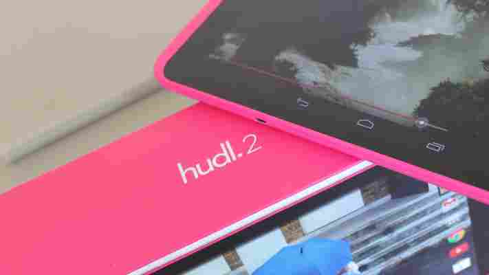
As you can see here, with the Hudl1 straddling its successor, the tablet has essentially been stretched with a rolling-pin across the way, meaning it’s more like a widescreen version of the original.
The screen itself is now 8.3-inches diagonally (full HD), up from 7-inches, which makes for a better viewing experience.
But although the height of the device remains the same, the bezel has been scythed which means there is more screen vertically and horizontally with the Hudl2. The original Hudl had a visible top-to-bottom screen real estate of around 3.75 inches, a figure that has been boosted to almost 4.5 inches.
While the Hudl2 is a little heavier (404g vs. 370g), it’s also a little thinner, which will be good news for many. It certainly feels slimline in the hand, and Tesco has worked well to maximize the screen real estate without compromising too much on the overall girth.
The device ships in eight colours – Jazzy Blue, Zesty Orange, Slate Black, Rocket Red, Tropical Turquoise, Dreamy White, Perky Purple and Bubblegum Pink. We got our hands on the pink one which, while maybe not exactly to our tastes, is nothing a £10 case can’t fix .
Out of the box you get a Hudl2 (obviously), a Hudl-branded wall-charger and a micro USB cable. And although Blinkbox’s future may be in doubt , you will also be given £25 of credit to spend on movies/TV shows through the video-on-demand (VoD) platform, as well as a handful of other discounts from across Tesco’s myriad of services.
On the back, you’ll find a 5-megapixel camera, with a single speaker down each side. On the top rim (held in landscape), is the power and volume buttons, and down the right is the micro USB port. The left edge is reserved for the headphone socket.
The bottom edge is where Tesco continues its push to make the Hudl a family focused entertainment machine. As with the first incarnation of the tablet, there is a microSD slot which enables you to expand the capacity from 16GB to 48GB ( read : lots of movies for long camping holidays), and a HDMI slot to hook this baby directly to your TV at home.
The Hudl2 also sports the same feel as the original, with a soft, velvety-plastic casing not too unpleasant to the touch.
Looks are only part of the picture, and you’re probably more concerned with how the Hudl2 performs and what it has to offer.
The Intel Atom quad-core processor ( up to 1.83GHz) offers enough speed for most day-to-day tasks, while the 2GB of RAM is decent.
The tablet runs on Android’s Kitkat (4.4.2), and doesn’t feel massively skinned on first inspection. Indeed, there are a slew of pre-installed Tesco bookmarks and apps on the homescreen, which unfortunately can’t be uninstalled. But otherwise, things are about as customizable as you’d expect from any Android tablet.
That said, a quick swipe to the right on the homescreen reveals a very Tesco-focused section with Cards that are seemingly hardwired in to the device.
These can actually be hidden from sight by hitting the three little dots at the top-right of each service, though the ‘Hide for Now’ message you’ll see alludes to the fact that this ‘hiding’ is temporary – the cards will come back reasonably swiftly. At least, they did for us.
However, if you’d rather not shy away from these services you can personalize things by signing in to your Tesco Groceries account, as well as your Tesco Clubcard, Blinkbox Books and Blinkbox Music accounts. Over time, these will serve up tailored content directly to your homescreen.
While the Hudl2 is largely like any Android tablet, insofar as you can download any apps from Google Play, add widgets, and otherwise personalize the device, Tesco’s latest launch does stand out in one key area – its focus on families.
Tesco has hooked up with The Parent Zone to develop tools that let you share your tablet with your kids in the knowledge that they can only access content based on the rules you’ve implemented.
Much of this is possible due to key built-in Android features. For example, when Google lifted the lid on Android 4.2 in 2012, users were at last able to set up individual user accounts on tablets – much like a PC – so that mum, dad and all the children could create their own little personalized worlds for their apps, books, games and more. Then with Android 4.3 announced last year , Google took things one stage further, introducing Restricted Profiles, giving parents more control over what their kids can and can’t access.
The Hudl2’s Child Safety app comes pre-loaded, and lets you tailor profiles and access permissions for up to seven users.
First things first, you’ll have to set up some Child profiles – something you can actually do through the main tablet settings, but this app provides a more user-friendly interface for doing so.
You can edit and add new profiles any time you wish, each of which can be protected from further editing with a PIN, password or handful of other security options.
There are three main facets to the Child Safety tool: Web safety, time limits and app safety.
The built-in Child Safety Web browser has been created so that kids can only access websites suitable for their age, based on restrictions put in place by the parents.
Broadly, you can switch off access to specific categories within the Web browser, covering Games, Search Engines, Religion, Charities, Sports & Entertainment, and more.
If there are specific sites within a category you wish to ensure are always available, you can add the URL to the ‘Websites’ section of the Web filters.
Web content is filtered by age: pre-school (under 5), infant school (5-8), junior school (8-11) and senior school (11-13).
The second notable facet of the Child Safety app is that you can stipulate time-limits for how long your son or daughter can use the tablet before it locks down. So you could free up ‘9am to 6pm’ on weekdays, but then put an upper limit of three hours in place, thus forcing them off to go play football instead (in theory, at least).
However, this could be a little more granular. As things stand, you’re limited to ‘Weekdays’ and ‘Weekends’, with no wiggle-room for differentiating Monday from Friday, or Saturday from Sunday.
At any rate, once the time limit has been reached on a specific profile, the user will be met with a message such as this. If you wish, you can allocate more time on the spot by entering the password and changing the parameters.
The third facet to the Child Safety tool lets you limit access to specific apps according to the profile of each user.
So you may wish to keep your 7-year-old away from Facebook and Angry Birds, but let them use YouTube, Calculator, Camera and Wikipedia. Conversely, your 14-year-old may be allowed to use every installed app, but for various reasons you may wish to block them from using the Web.
Strangely, some apps can’t be used on other user profiles. For example, Dropbox, Gmail, Calendar and a few others can only be used on the main user profile, which is a little odd – we can only assume there are some restrictions enforced by the companies behind these apps.
With a passcode in place, this is roughly what your lockscreen will look like. You’ll note the individual profiles at the bottom, with the parent’s accessible only by circumventing the security measure (PIN), and the additional accounts (children) accessible by anyone.
The respective homescreens will then look a little something like this – all apps you’ve permitted will appear, as will the Child Safety browser. It’s worth adding here that you can also let your kids access other browsers, such as Firefox and Chrome, but you won’t be able to filter ‘inappropriate’ content through these portals.
If you don’t have kids, then the Child Safety feature will likely lie redundant on your device, which is no big deal really. But battery… that IS a big deal, right?
Whether the Hudl2 is being passed from child-to-child in your house, or you’re using it yourself to binge-watch Breaking Bad, the battery life is always a crucial component with any mobile device.
I used the Hudl2 solidly throughout Sunday, streamed a half-hour show on iPlayer, watched the best part of a whole football match on BT Sport, and did some general Web browsing and music streaming. There was plenty of battery after all this, so I also left a movie streaming when I left the house for a bit – just to see what was left when I returned.
The good news is that Tesco’s claims of 8 hours isn’t wildly over the top. I got around 7 hours based on the above use-cases with around 5 percent juice left at the end. From this, it then took a full three hours to fully charge again.
So the battery performance is decent, if not off the chart.
A pet peeve of mine is advertised hard-disk space versus actual hard-disk space . Remember the furore around Microsoft’s Surface Pro 64GB tablet that shipped with a mere 23GB of actual usable storage ? There seems to be no hard-and-fast rule that tells you how much actual space you’ll get out of the box. The only real way of knowing is to buy the device and check for yourself.
The 16GB Hudl1, for example, had 12.66GB of total usable space, which is before you consider things like pre-installed apps, media files or the operating system itself. This drives the actual available space down to substantially less than what you were expecting before you’ve even had a chance to take your first selfie.
With that in mind, the 16GB Hudl2 comes with a mere 9.12GB of total usable space out of the box, and only around 7GB of actual available space (the screenshot below includes a handful of apps I’ve installed myself, hence why it shows as even less). This isn’t great, if I’m being honest.
Sure, the Hudl2 comes with a microSD card slot, meaning you could boost the capacity substantially for less than £20. But still, I long for the day when hardware manufacturers advertise how much space you’re really going to have to play with when you first unbox a device.
Audio
One of our minor complaints with the original Hudl was the speakers, which we said at the time sounded a little tinny . I’m always more inclined to use Bluetooth speakers or headphones with a tablet, so it’s never an issue for me – but not everyone is the same.
The Dolby-optimized stereo speakers on the Hudl2 are a marked improvement on the first incarnation, so if you’re an audiophile then you will be happier with the upgrade here. That said, if you really ARE an audiophile, you would still want to listen to audio through headphones or dedicated speakers.
Screen
For me, the crowning glory of Tesco’s newest tablet is the visuals. The 8.3-inch, 1920 x 1200 (Full HD) screen is impressive, certainly for the price point. I watched a number of HD videos on the device, and was blown away by the crisp, clear sharpness of it.
Coupled with the turbo-charged audio, and it’s easy to see the Hudl2 becoming a huge hit with families as an entertainment device.
Camera
With a 5-megapixel rear-facing snapper, the Hudl2 has been given a 2-megapixel boost. Meanwhile, the 1.2-megapixel front-facing shooter has shed 0.8-megapixels on the original. But these numbers may as well be written in ancient Greek for all I’m concerned.
Just as I don’t buy a budget Android tablet for the speakers, I don’t generally look upon any tablet as a photography device. But that doesn’t stop others from doing so.
Neither camera on the Hudl2 produces particularly great results, particularly in low-lighting, but they’ll suffice for kids looking to take selfies, random photos of trees, or snaps of the neighbour’s cat.
The camera also comes bundled with the usual add-on features you’d expect, helping you create photo spheres and panoramas.
Overall, the camera is fine for playing around with, but there’s nothing here that sells the Hudl2 as a mobile-photography must-have. But then again, what did you expect for £129? Corners have to be cut somewhere.
Having spent a weekend tinkering with the Hudl2, I can honestly say that Tesco has come out with another gem.
The first Hudl surprised many, as the expectations from a supermarket’s own tablet were probably quite low to begin with. But it went on to shift 750,000 devices, which says a lot not only of the demand for affordable tablets, but for Tesco’s price point. It gave a lot of bang for your buck.
With the Hudl2, Tesco had to up its game even more. Yes, it’s slightly heavier this time around, but it’s also thinner, offers a wider and taller screen and has much improved audio. With granular controls for families, it’s clear that the supermarket titan is vying for a big chunk of the lucrative family tablet market, and it has done well to push these child-centric controls front-and-center.
But for me, the real killer ‘feature’ is the picture quality. The full HD screen is fantastic, and puts it on a similar playing field to that of the Nexus 7, which costs £40 more . The Kindle Fire HD (7″) comes in at £140 – only £10 more than the Hudl2 – but it has a lower resolution screen.
This alone should ensure that everyone from students to pensioners will be lining up to buy one when these go on sale for £129 come October 9. Yes, the Hudl2 is great for parents, but it’s much more than a family affair.
➤ Tesco | Hudl2
