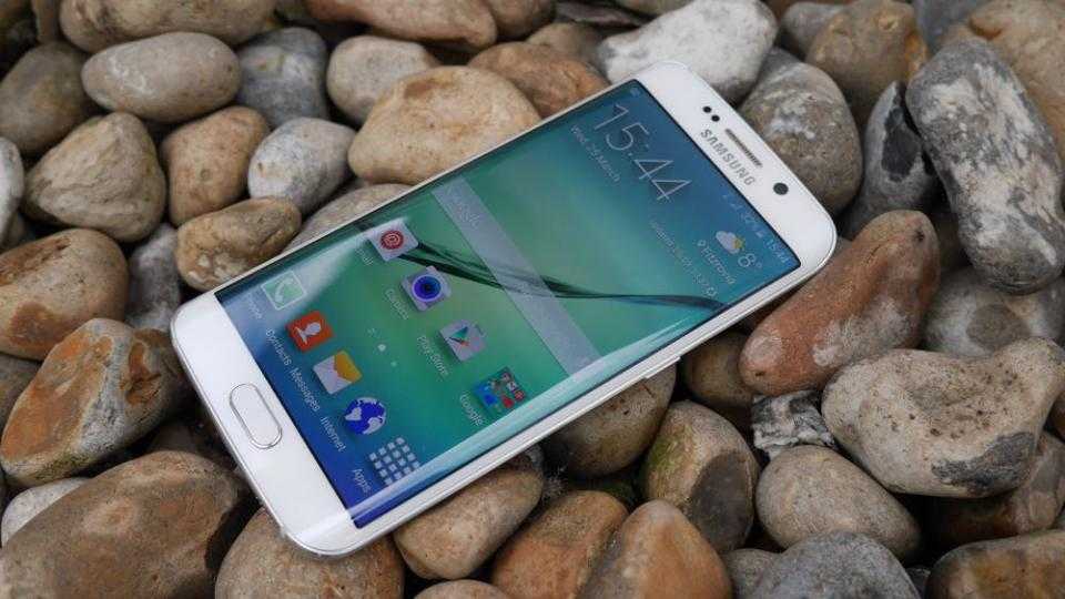
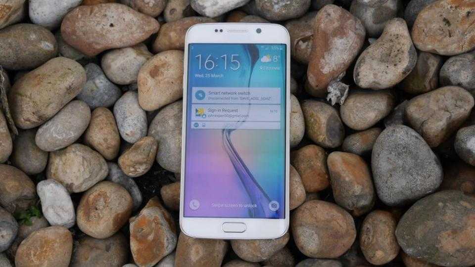
The Samsung Galaxy S6 may have finally given people the metal phone they wanted, but it's the S6 Edge that everyone will truly desire – provided you've got deep enough pockets to afford one, that is.

With SIM-free prices for the standard 64GB version starting at an eye-watering £760, and contracts starting at around £43.50-per-month with an upfront cost of £50, it's considerably more expensive than either the equivalent iPhone 6 or iPhone 6 Plus (the latter of which costs £699 for the 64GB version and £789 for the 128GB version).
Samsung Galaxy S6 Edge review: Design and build quality
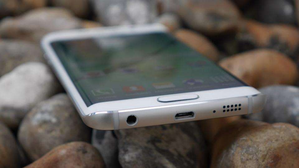
Following in the footsteps of the Galaxy Note Edge , which had one curve along the right-hand side of the screen, the S6 Edge's display has curves on either side. The angles are much subtler than the Note Edge's, as Samsung's decided to ditch the separate sidebar to make the screen appear like it's simply falling away round the side.
The two curves still pick up no end of reflections, but the tapered edges feel great in the hand. They not only make the phone feel much thinner than its 7mm chassis might otherwise imply, but the sharper, more angular frame also provides plenty of grip. I actually prefer it to the smooth, rounded corners of the S6, which constantly felt like it was about to fly out of my hand. The S6 Edge, on the other hand, felt much more steady and secure when using it single-handed. It's still a little slippery due to its rear glass panel, but at least the edges provide two good points of purchase.

Samsung Galaxy S6 Edge review: Edge screen
I'm quite glad the sidebar from the Note Edge has been hidden from view this time round, as I found it awkward to use and felt it didn't really add much to the phone's overall utility. That doesn't mean Samsung's abandoned its Edge Screen features, though, as they're now activated by simple touch gestures so they don't get in the way during day-to-day use.
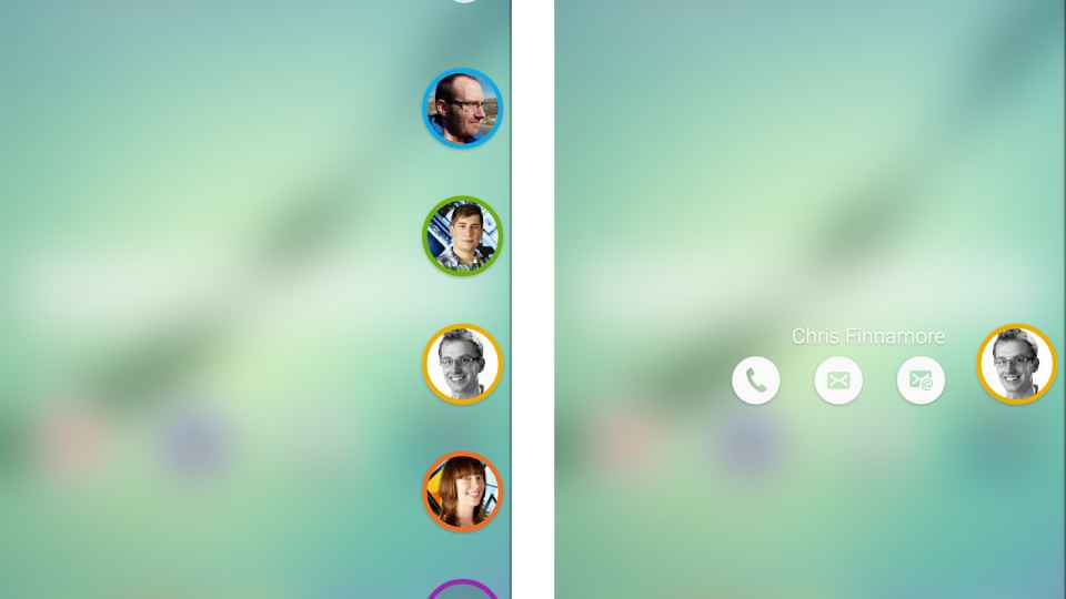
Instead of the sidebar, for instance, the S6 Edge now has a small translucent tab at the top of the screen which you can slide out to access your five favourite contacts. From here, you can call them, send an SMS message or send an email. It's a useful feature, and one that works incredibly well when you have both hands free.
Trying to activate it single-handedly, however, is a little more fiddly, as the curve's shallow angle means you're more likely to swipe to the next home screen or accidentally open the weather widget than open the tab. Still, with a bit of practice it became much easier to open with a single swipe, and it's certainly much quicker than having to dive into my contacts or email app every time I want to get in touch with someone.

^ You can select up to five contacts on the People Edge tab, allowing you to call, text or email them quickly with just a swipe and a tap
I also like that you can colour code these contacts, as the phone will then flash in that particular colour when those contacts try to call you. However, this only works when the phone is face down on the table, which isn't particularly practical no matter how much confidence you have in the screen's Gorilla Glass coating. It's still something I'd be loathe to do on such an expensive handset, and the effect isn't actually that pronounced either. If you had your phone on silent, for instance, it's quite possibly you'd miss it altogether if you didn't have a direct line of sight to the phone's underbelly.
However, if you do catch it but are unable to take the call, you can cleverly place your finger on the rear heart-rate monitor to send a text message explaining that you can't answer the phone right now. Likewise, if you turn the phone back over and have missed any notifications from your key contacts, a coloured tab will appear on the side of the screen. All you have to do is swipe in from the tab to bring up the full details. It's a neat way to keep in touch with people, and feels far more integrated than the Note Edge's approach, which treated the curve as a completely separate display.
More useful is the Night Clock, which makes a welcome return from the Note Edge. I like this feature a lot, as it means you don't have to keep turning the screen on at night to check the time – which is particularly useful if you're travelling and don't already have a digital clock in your room.
You can only activate it for 12 hours a day, but during that time it will always show the time and date on the edge of the display. Since the S6 Edge has a Super AMOLED display as well, which has individually lit pixels rather than a backlight on an LCD, it shouldn't use up much battery either. The Night Clock isn't particularly bright, so it shouldn't disturb you when you're trying to get to sleep.
Finally, there's a revamped version of the Information Stream sidebar, which can be accessed by quickly swiping up and down on the right hand edge when the screen's turned off. Here you can see vertical notifications, such as missed calls or unread emails, Yahoo news items, what's trending on Twitter, or even your own RSS feed. It works well enough, but its cramped size means it's not particularly easy to read and you don't get much information before the text starts disappearing off the end of the bar.
Admittedly, none of these features are really worth paying extra for, but I'm pleased nevertheless to see Samsung's making a concerted effort to integrate the curves more intelligently into the phone's overall design. Even if this wasn't the case, though, I can't deny that the curves really do make the S6 Edge one stylish-looking handset. Compared to the door stop design of its Note-branded cousin, the S6 Edge is as slick as they come, making it something you really want to own and show off, regardless of whether the curves actually do anything useful. Fortunately for the S6 Edge, it does succeed in making the phone more practical, even if some of its features aren't quite as good as they could be. For another take on the utility of the new S6 Edge features read our sister publication Know Your Mobile's review of the handset.
Samsung Galaxy S6 Edge review: Display
Either way, you certainly won't be disappointed with the S6 Edge's 5.1in display. As I've come to expect from Samsung, the S6 Edge uses Super AMOLED screen technology, but it's increased the resolution from 1,920x1,080 on the S5 to 2,560x1,440 (QHD).
That's the same resolution as the LG G4 , but since Samsung's used a smaller screen, the S6 Edge (along with the S6) has the highest pixel density of any other QHD handset I've seen, coming in at a staggering 577 pixels-per-inch. Combined with the curved edges, the screen really pops out at you, making whatever you're doing that much more involving.

I certainly noticed how sharp the screen was, and the colours were equally excellent. I've always been impressed by Samsung's AMOLED technology and our colour calibrator measurements didn't disappoint. It covered a full 100% of the sRGB colour gamut and blacks were a near-perfect 0.02cd/m2, ensuring rich, vibrant colours and dark, inky blacks. The screen's contrast levels were also off the charts, providing plenty of detail on our test films and photos.
Our initial brightness measurements were also good, for an AMOLED display at least. 346.5cd/m2 was still a long way off Samsung's claimed 600cd/m2 estimate, which is higher than the capabilities of most LCD displays. For example, the HTC One M9 managed 478.5cd/m2 at its highest brightness setting. AMOLED screens are typically much dimmer.
However, take the phone outside and it's clear that Samsung has finally fixed the issue of outdoor usability on AMOLED screens. My live brightness reading shot up to a huge 577cd/m2 when using the automatic brightness setting in direct sunlight. This is a first for an AMOLED smartphone, and dramatically boosts screen clarity when you're outdoors. Colours look punchy and I had no trouble using it in direct sunlight. Even better, this extra brightness is only available in Auto mode, which will help prevent unwanted power drain when moving from outside to indoors. Samsung has combined the best features from AMOLED and LCD screen technology, making this one of the best smartphone screens I've ever seen. Continues on Page 2
