Ever-reliable leaker Evan Blass of Venture Beat has just given us our best look at Samsung’s Galaxy S8 yet. The report confirms several of the details we’ve already learned about the device, as well as providing an announcement and release date.

Blass confirms that the devices are foregoing the front fingerprint scanner for one place on the rear, adjacent to the camera, and that Samsung will implement the Note 7’s iris scanner. Samsung will also likely be dropping the ‘Edge’ moniker this time around, as both sizes will come with a curved display. And as detailed in a previous report by The Guardian , the devices will come in two screen sizes: 5.8-inches and 6.2 inches.
Yes, that makes the diagonal on both screens longer than the Note 7’s. This is thanks to a new, longer 18.5:9 aspect ratio to minimize the device’s bezels, as seen with Xiaomi’s Mi Mix and rumored to be coming to LG’s G6 . The screen is rumored to take up 83 percent of the front, compared to 72 and 76 for the Galaxy S7 and S7 Edge, respectively. Blass suggests Samsung isn’t even putting a logo on the front of the devices, unlike teased in a previous supposed leak (perhaps it was a prototype?).
Also confirmed by the image: a headphone jack!
Both devices will come equipped with a Snapdragon 835 (or a new 10nm Exynos, depending on the region). The processors are purported to be 11 percent faster, provide 23 percent graphics and use 20 percent less battery. Which is good, because the devices are maintaining the same battery sizes, 3,000 and 3,500 mAh, despite the larger screens. Of course, it’s possible Samsung has also made the displays themselves more efficient.
Other leaked specs indicate the phones will remain at 4 GB RAM, but get a boost to 64 GB of storage by default. While the selfie camera is getting a boost from 5 to 8 MP, the rear camera will remain at 12 MP. Of course, resolution is just a part of the equation, and we don’t know if Samsung is making other improvements to the hardware.
But on the software front, the devices will feature some object recognition chops, allowing for “visual search functionality.” That might help you shop for things you’ve photographed or translate text, but those are just guesses for now.
Also on the software front, the phones will reportedly come with a feature called DeX that allows you to use your phones in a desktop mode by connecting them to an optional dock, much like Microsoft’s Continuum . The phones will also be the first to introduce Samsung’s voice assistant, called Bixby.
Finally, and as previously rumored, the devices won’t be announced during Mobile World Congress as usual. Instead, Samsung is waiting an extra month to announce them at an Unpacked event in New York on March 29. The phones will then be released on April 21.
That’s because Samsung is being extra cautious after its Note 7 battery fiasco, which is probably the right move. It’s also worth noting that the company is rumored to be keeping all the Snapdragon 835 chips for itself , so if you want the latest and greatest Android performance, you’ll have to wait until April.
How sticky is your wearable? 6 ways to keep your wearable device from being mothballed
Jen Quinlan is the Senior Marketing Director at Mutual Mobile, an emerging technology agency.

The quantified-self movement, which started in 2007 with small groups of personal trackers who kept logs of what they ate, how long they slept and how many steps they took, has morphed mainstream . Today, a tiny device worn around your wrist can monitor all of these pieces of data and more, no excessive journaling required.
Wearable tech gadgets, specifically directed at fitness but able to monitor practically anything, are being launched by every major player in the tech space as well as a slew of start-ups. And with recent announcements from Google , Samsung, and much speculation on something from Apple, this is clearly a fad that has pivoted to a viable business opportunity.
The sheer volume of wearables flooding the market is a boon for consumers and a terrifying prospect to marketers. Devices are being made to meet consumer needs of all types. Want to track your steps? Done. Want to track your pace? Done. Want to track your calorie intake to lose weight? Done.
But what keeps your consumer loyal once they buy? What is to keep them from switching to a different device? Certainly not price – the price point for wearables is dropping every day, making it completely reasonable to just buy another one if the first option didn’t work out.
Marketers and device manufacturers are looking for a way to ensure their product remains in use. The good news? There is a way to make your wearable stickier (and not in a gross way).
The most powerful marketing effort is to engage your target audience in the prototype phase to help inform the product that is actually built. This tried and true technique has been used by Google (gmail, Google Glass) time and time again.
Even if you cannot afford a large-scale user study, investing in user research can be well worth your money to ensure you’re building something people need, want and will continue using. Also, those early adopters who participate in your research become your first product enthusiasts, evangelists and social ambassadors.
The first interaction with your audiences needs to secure a commitment. Robert Cialdini’s six principles of influence pinpoint commitment and consistency as an essential step to getting your user engaged. He notes even the tiniest commitment makes a user more likely to see an activity through to completion. This is why coupon cutting works so well for grocery stores and brands – cutting the coupon is a tiny commitment to that brand that you will buy the product.
Ask for daily check-ins, or daily use for a month. The strongest surge of motivation your users will have is the first couple of days after purchasing it – get them committed to a long-term engagement to encourage consistent use.
Most people purchase a wearable device with a specific goal in mind and the devil is in the details. ‘Lose weight’ is very different from ‘lose weight to go to my reunion’ which is light years away from ‘lose weight for wrestling weigh-in.’
Poll your users, determine what their goals are and then help them set attainable goals that will keep them coming back for more. Statistics Brain reports a mere 8 percent of people achieve their New Year’s Eve resolutions – likely because they are not feasible.
Becoming a trusted partner to your users in setting and helping them achieve their goals creates an emotional bond that is near impossible to break.
As we know, setting and meeting goals is a heady drug. Once reasonable goals have been set with your user, remind them, support them, and congratulate them. When users see improvements (improved sleep, improved weight management, improved hydration) through the use of your wearable, they are more likely to keep using it.
A word on user support: this has to be personal without being creepy. A truly successful wearable will feel a lot like Big Mother, knows everything about you (because it should) and has your best interests at heart. It will feel nothing like Big Brother, serving up ads and advice to meet its needs rather than the users.
Never underestimate the power of positive reinforcement. This is more than just an online badge to gamify the experience. Give them something physical, something they can hold and feel pride in. All the fuel points in the world don’t compare to a medal for your one-millionth step. This is Volvo Heritage Club 101.
Think about rewards as the personal connection you can have to your user base. Companies like YouEarnedIt have applied the personal reward model to employee engagement with overwhelming success. Giving management and peers an easy way to acknowledge coworkers that, in the end, results in physical goods, promotes teamwork, accountability and increases enthusiasm.
Customer service is essential for wearables – both good customer service and personal customer service. Wearables are the epitome of a personal device – they are tracking something that is of the utmost importance to their user. A tiny glitch can relegate your device to the desk drawer in an instant.
If you see a fall-off in activity, follow up with the user within 24 hours with a customer service rep to see what is happening and how you can help them get back on track. If you hear grumblings on social media about a problem, address it. Fast. The information you are tracking is not just data points to your users. Respect that, and let them know it.
Wearables have the potential to be life changing for your users, which makes it critical to have a user-centric approach to the creation of your physical product, software product, and ongoing customer service experience. Keeping the user front and center as you design, implement and improve your product will ensure your users stick to their wearable.
Motorola’s custom color tool for the Moto X is live. Here are 10 of our favorite combinations.
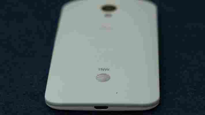
Motorola today opened up its Moto Maker design process for its flagship Moto X smartphone on AT&T. The device has turned out to be a solid smartphone , and its most differentiating feature is the ability to hand-pick from a swath of colors and other features.

With 18 back colors, 7 accents, and 2 front panels to choose from, there are hundreds of choices available, though sadly you won’t get yo choose your carrier since the color options are an AT&T exclusive for now. Also, the engraving feature won’t be available at launch because of quality issues.
Customers can either place an order in-store and then design the device online, or complete the whole process using the Moto Maker Web tool . If you only want the standard black and white versions of the Moto X, AT&T will have those on hand at retail locations. If you’re not willing to go with AT&T, you can wait for Verizon to begin selling the black and white versions on August 29th. Motorola also says it will begin direct sales of an unsubsidized version of the Moto X for $579 later today.
To learn more about the Moto X ordering process, take a look at my hands on with the Moto Maker piece. After poking around with the tool, we came up with the following 10 combinations:
Back: Cement Accent: Orange Front: Black
This phone means business. Cement and black keep things professional, but splashes of orange add some personality.
Back: Navy Blue Accent: Silver Front: White
Now you can look as sleek as a Navy SEAL without all the grueling physical training. So hot right now.
Il Vino
Back: Cabernet Accent: Purple Front: White
Perfect for oneophiles who have always wanted a nice wine pairing for their smartphones. Chardonnay in the front, cabernet in the back.
Back: Spearmint Accent: Red Front: Black
This combo will keep you feeling minty fresh all day long. The bright green back makes a fun statement without going overboard.
Back: Raspberry Accent: Yellow Front: White
This raspberry lemon sorbet-inspired scheme feels positively lickable, but you should never, ever lick your phone. At least not in public.
Back: Woven black Accent: Red Front: Black
This combo is a stealthy, stone-cold killer. Sure, true ninjas might go with all black to remain undetected, but why go to the trouble of custom-picking your phone colors if you’re not going to pick an actual color? If it helps, imagine the red accents are the bloodstains of slain enemies from a rival clan.
Back: Lemon lime Accent: Yellow Front: Black
There are lots of reasons to go with a nice yellow and black combo – perhaps you have a deep love for Transformers , the Steelers or apiculture . Just keep in mind this is lemon-lime, so it’s going to show up with more of a green tinge than the screenshot shows.
Back: Olive Accent: Orange Front: Black
Admittedly, some of the combinations on this list are a tad loud for everyday use. This olive/orange piece keeps things classy while also reminding me of a tasty tapas dish. Now where did I put that Spanish ham?
Back: Cherry Accent: Blue Front: White
Since the Moto X is manufactured in America, you show off your patriotic side with the old red, white and blue. It’s a touch garish, but…’MURICA.
Back: Mint Accent: Yellow Front: White
I ended up choosing this combination when ordering a Moto X because I liked how yummy it looked. It’s a softer look than I would normally prefer for a phone, but it struck a balance between having fun with the color choices and still being muted enough for everyday use.
