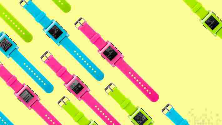
Pebble is dropping the price of its e-paper display smartwatches and rolling out an update that improves their health and fitness tracking capabilities.

The original Pebble, including the three neon color variants announced in August , are now available for $99/€129/£99. That’s a $50 reduction and positions the smartwatch as a cheaper alternative to Android Wear .
The premium Pebble Steel , meanwhile, is receiving a similar $50 price cut. You’ll now be able to pick one up for $199/€229/£179, which is less than Motorola’s Moto 360 ($249), only a fraction higher than the LG G Watch ($179) and on par with the Samsung Gear Live ($199) in the Google Play store.
On the software side, Pebble is rolling out an update (firmware 2.6) to make it easier to track your exercise and sleep quality. Once installed, you can run health apps in the background while another app or watchface is open.
Pebble is highlighting three apps that take advantage of the feature: Misfit , Jawbone and Swimom . The Misfit for Pebble app, released in June , has been updated with non-stop exercise and sleep tracking. Other smartwatches, especially in the Android Wear space, offer less than perfect step counting and so there’s an opportunity for Pebble to position itself as a viable upgrade to standalone devices such as the Fitbit, Nike+ FuelBand and Jawbone UP.
Jawbone recently launched a new iOS app that doesn’t require one of its trackers; as part of its broader platform strategy, the company is also launching a Pebble watchface called UP that you can download to track and monitor your activity. Finally, Swimom is boasting one of the most comprehensive swimming Pebble apps (it’s not the first , mind you) with the ability to measure total distance, average pace, time and strokes. Data is automatically synced with the swimmer’s smartphone when the two devices are in range.
Finally, Pebble is pushing its smartwatches through new retail channels. The company’s wares will soon be available in Sprint stores across the US, as well as Carphone Dixons and O2 in the UK. Pebble will also launch in Benelux (Belgium, the Netherlands and Luxembourg) and the Nordics tomorrow.
Top image credit: Pebble
11 things I learned during two weeks with an Apple Watch
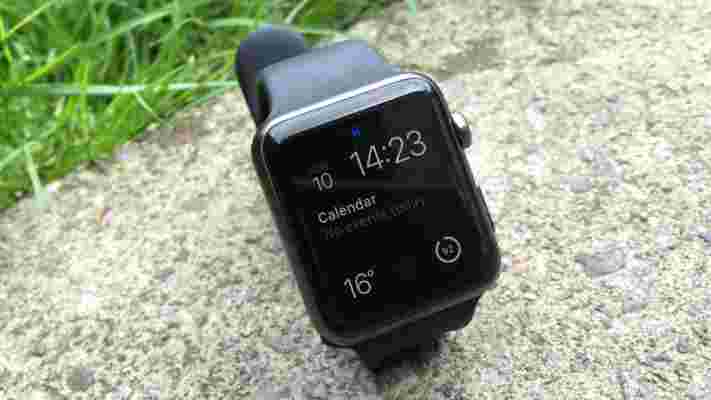
It’s now two weeks since I took delivery of my 42mm Space Grey Apple Watch Sport and awkwardly (see point 7 below) placed it on my wrist.

I haven’t tried to do any kind of stress-test on the device here. There are reviews elsewhere online if you want to read about someone trying everything the Watch can do.
But is the Apple Watch worth it? My approach was to let the Watch just fit into my life and see what happened. Here are 11 things I’ve learned from a fortnight of using it.
1. It became a normal part of my life surprisingly quickly
I’m not one of those people who had to ‘re-learn how to wear a watch.’ I’ve worn one pretty much every day since my tenth birthday, and the idea of pulling my smartphone out of my pocket to check the time never quite matched up to a quick glance at my wrist.
Still, I thought it would take more getting used to than it did. Within three days, putting the Apple Watch on in the morning and placing it on charge before bed became a part of my routine. As yet, there’s been none of the ‘forgetting to wear it and getting out of the habit’ that quickly blighted previous wearable tech that I’ve tried, although I’d argue that people who are used to wearing a watch every day anyway have an advantage over the ‘re-learners’ here.
2. The battery life is surprisingly good
Apple says the Watch’s battery will last 18 hours, and I was expecting to have a few scrapes where I’d struggle to have a working device on my wrist by the end of a long day.
In reality, I’ve never see the Watch dip below 50 percent battery life with about 16 hours of wear. Point 3 below helps explain this, and I’ve not used it to track any intensive workouts, but with several time-checks per hour, regular interaction with notifications and occasional app usage throughout each day, I’ve never once been worried about running out of juice.
3. I’ve had very little inclination to use the apps
While there’s no shortage of iOS apps that support the Apple Watch, actually using them is often more trouble than it’s worth. It feels like pot-luck as to whether an app with load in two seconds or 15. And if it takes too long, the screen switches off while the ‘loading’ icon continues to spin. You often could have got your phone out and done whatever you needed to do there in that time.
The key use case for choosing to do something on your Watch instead of your iPhone – wanting to do it as quickly and discreetly as possible – just isn’t a reliable reality yet. For example, whenever I show someone the Uber app, it seems to work perfectly. Whenever I actually want to order a car through the Uber app though, it takes so long to load that I just end up using my phone instead.
There is hope, however. The first generation of Apple Watch apps were generally written by people who hadn’t actually worn one. Marco Arment has written an interesting piece about how he’s refined Overcast’s Watch app based on real-world usage, and over time we’ll no doubt see improved ‘best practice’ for designing and coding Watch apps emerge.
Still, as Arment suggests, the WatchKit SDK and the Watch hardware itself may need to be improved before we get to a situation where apps are a true joy to use.
4. Talking into a watch is a great experience – when you’re on your own
I’m not sure I’ll ever really get used to talking to devices – at least not until I can use my most casual voice and conversational language, and get an accurate result. Still, whether I’m setting a reminder, asking Siri a question or dictating a message to send, I’ve found the Apple Watch to be very precise at turning my words into text.
It’s something I only do alone, though. The Apple Watch is less useful in public because talking to my watch on a tram, bus or train, or even in the street, would just feel weird. I’d be imposing the tedious details of my private life (“remind me to buy some toothpaste at 6pm”) on strangers. It would be as awkward for those other people as it would be for me.
I just can’t imagine that talking to devices in public will become socially acceptable any time soon. It’s just a little too inconsiderate of others.
5. The current selection of watch faces isn’t that great
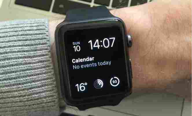
Having tried all the watch faces on offer, I’m only happy with the default Modular option. It’s the only one that combines a numerical time reading with space for five ‘complications,’ that allow me to see the date, my next calendar event, the current local temperature, my activity levels for the day and the Watch’s current battery level. The other faces just aren’t as useful.


Also, it’s a shame that no face offers a numerical reading of seconds – you get a second hand on the analog clock-style faces but as someone who likes both time precision and numerical clocks, I’m not quite satisfied with what’s currently on offer.
One unexpected plus about having the temperature displayed on my wrist is that I dress more appropriately for the day. UK weather can be highly unpredictable. It’s not uncommon to have chilly days and warm days side-by-side. Yes, I could previously check the temperature on my phone, but having it always right there on my wrist makes me more likely to notice it, act on it and not have to regret going out in a big jumper.
6. The Taptic Engine is great, when you get used to it
I was particularly intrigued by Apple’s ‘Taptic Engine’. Sure, some people have grumbled that it offers nothing more fancy than a vibration, but to me it’s very different to the vibration of your phone in your pocket. It really does feel like a ‘tap,’ and you get used to the varying feel of different notifications. Over time, that is.
At first I thought I had a defective Watch, as I rarely felt any taps at all. Then three things happened. Firstly, I turned the haptic level up to maximum in the settings (you can do this on the device or via the companion iPhone app) and that helped a little. Secondly, I realized that the strap that comes attached to the Sport model is designed for larger wrists than mine, and that the other strap that came in the box fits a lot better, holding the Watch snugly against my arm and allowing me to better feel the taps.
Thirdly, after a while, my brain got ‘tuned’ to notice the more subtle taps, such as the short but insistent one when the Watch reminds you to stand up every hour for the good of your health. Now I’m perfectly happy with the taps, so give it some time if you start off worried that you’re not noticing them.
7. You’ll probably switch the sound off in minutes
Audio notifications are on by default when you first get your Watch. Unless you have particular accessibility requirements, you’ll probably switch them off sharpish. The Taptic Engine offers far more appropriate notifications for a watch – subtle and personal.
8. The Sport Band is fiddly to get on
Putting the Sport Band on requires you to flip your wrist and the Watch over and, with your one free hand, wrap it over itself, pop the plastic knob through the right notch and then slide the rest of the band through the slot.
It’s not difficult per se, but it feels more awkward than it should, and it’s not very ‘Apple-y.’
9. iPhone battery life seems to take a hit
Before the Apple Watch launched, there were two schools of thought about iPhone battery life. Either the power used by all that Bluetooth communication between the two devices would be made up for by savings from not having to actually use the phone quite as much, or it wouldn’t and your iPhone would have a bit more of a fight to get through the day.
It turns out, for me at least, that the latter is true. I tend to have to give my phone a juice boost sooner in the day than I used to. While my Apple Watch gets through the day pain-free, it’s the iPhone that takes the strain.
10. The learning curve really isn’t that challenging
Reading the earliest reviews and watching the tutorial videos on Apple’s website ahead of my Watch arriving, I was concerned that the UI seemed a bit too complicated – the ‘constellation’ of app icons too messy, the different uses of the two buttons and Force Touch a bit too hard to remember.
As it turns out, that’s not the case at all. Use it for an hour, make some mistakes and learn from them, and you know everything you need to know.
The only part of the whole interface that’s a pain to master is taking a screenshot. To do this, you hold one button down and then tap the other. However, it doesn’t work on every screen, and often get the timing wrong and end up launching Siri instead of capturing an image. The chances are slim that many users will ever really need to take a screenshot though, so it’s not a big deal.
11. It’ll take a long time for checking your smartwatch in company to become acceptable
There I was, chatting face-to-face with someone. Suddenly my Watch tapped me to notify me of… well, I didn’t know what. Knowing that looking at your watch is long-established body language meaning ‘I need to go’ or ‘you’re boring,’ I tried to check the notification as subtly as I could. It wasn’t enough – the woman I was with spotted me doing it. “Sorry, do you have to go?,” she asked.
“No,” I replied, “my sister just sent me a Facebook message.”
It’s going to take a long time for society to shift this body language barrier blocking the use of a smartwatch to its full capacity. Maybe we never will. Maybe established norms will kill smartwatch use in polite company. Looking at your smartphone during a conversation, a more recently-introduced behavior than glancing at a watch, is far more socially acceptable. The Apple Watch, and smartwatches in general, work best when you’re on your own.
___
For me, the Apple Watch is best thought of as simply a watch. A very nice watch with some useful smartphone integrations, especially for getting your most important notifications without having to pull your phone out of your pocket, but still it’s essentially a watch. It’s not going to change your life.
If you like (and can afford) ‘nice things’, it is worth the price: get one and see how you fare with it. Otherwise, hold off and see how the device and its app ecosystem develops over the next couple of years – you’re not missing anything essential… yet.
Don’t miss: The Apple Watch hates tattoos: An expert explains why
HTC boosts its mid-tier offerings in Asia with the Desire 616, a $240 dual SIM smartphone
HTC is making a big play for emerging markets this year as it seeks to reverse its losses, and today it has rolled out a new dual SIM phone as it seeks to launch more devices with a variety of price points to capture more potential customers.

The HTC Desire 616 was first launched in China over the weekend but is now on sale across North Asia, South Asia, China and Russia. There are no plans to release the device outside of Asia, a spokesperson told TNW.
This comes after HTC launched a plastic variant of its flagship One (M8) smartphone last month, which also includes dual SIM support.
The five-inch HTC Desire 616 is powered by a 1.4 GHz octa-core processor, a 2000 mAh removable battery and comes with 4GB onboard storage with the option of an additional 32GB of microSD storage. It also comes equipped with an eight-megapixel rear camera and a two-megapixel front-facing camera, both of which take 1080p HD videos as well.
Prices for the device may differ according to countries, but as a gauge, it is retailing for S$298 (US$238) in Singapore.
HTC has also added BlinkFeed, first introduced on the HTC One, to its latest device. BlinkFeed shows a stream of constant updates from news sites and social network, and there is an ‘Offline Reading’ mode that lets users still view articles on their list even without being connected — which is likely to appeal to users in emerging markets where people may be more conscious of using data. It also lets users add up to 120 articles to their reading list when connected to WiFi and access them offline.
In a recent interview with TNW , Jack Yang, the president of HTC in South Asia, said that the company is beefing up its portfolio throughout this year, with a new device every quarter — and noted that the Desire family would play an important role in its strategy to tap on the mass market.
HTC recently swung to a profit in the second quarter, reporting a net profit of NT$2.26 billion ($75.6 million), an increase of 80 percent from a year ago and reversing the net loss of NT$1.88 billion in the previous quarter.
