The LG G4 was announced last month at simultaneous events around the world to much fanfare.

Touting higher spec hardware and a slightly redesigned chassis, the phone goes up against Samsung’s S6 and S6 Edge , the iPhone 6 and 6 Plus and Motorola’s lightly tweaked Moto X, as well as a range of others like the HTC One M9 .
But with small changes – at least on the surface of things – does LG’s newest range-topper have enough to draw the limelight away from more popular devices?
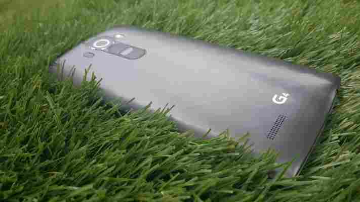
The LG G4 really hasn’t strayed very far from the LG G3 in terms of appearance. What I’d like to be telling you is that the new leather back is a worthwhile departure from the plastic-backed chassis we’ve seen previously.
I’d like to be telling you that the additional texture in the hand makes it easier to handle and less drop-prone. I’d like to be telling you all that, except the review model that turned up doesn’t have the new leather back.
Instead, I have to tell you how the G4 keeps the same plastic rear panel as its predecessor, albeit with a light diamond pattern this time, instead of an all smooth affair. I’m still yet to lay eyes (or hands) on a leather-backed model for more than a few minutes, so I can’t make a final judgement on how that option plays out in real life.
My instinct is that, while it probably does make it a little easier to hold and set it apart from the rest of the smartphone crowd, I don’t really see the appeal in the leather rear. You might though.
The curvature of the rear panel is designed to make it easy to reach around the whole device with one hand. It’s actually quite a gentle part of the design, but you can definitely see the difference between a flat backed handset and the G4 if you place them down side-by-side, as shown below next to an S6 Edge.
When compared to last year’s G3 model (below), you can see a difference in the curve and overall depth, although there clearly isn’t a lot in it. The G4 measures up at 148.9 x 76.1 mm and is 6.3mm thick at the edges and 9.8mm at its deepest point.
The headphone and charging socket are on the bottom of the device again, as with the previous model.
My G3 developed an intermittent issue that stopped it from recognizing when a headphone or aux cable had been plugged into the device. So far, I’ve seen no such issue on the G4, which is a relief.
Although not a deal-killer, the G3’s display wasn’t quite as bright as many people hoped – and while LG has kept the same panel size (5.5-inch with a 2,560 x 1,440 pixel resolution), the overall performance is far better.
It’s now much brighter, which is useful in direct sunlight, and has better reproduction of real-life colors. Images are stunning to look at, and the phone’s icons look nice and sharp. No blurriness here.
The audio side of things is a little less encouraging, but it’s still far better than some other devices out there – the Huawei P8, to name just one. In short, it tends towards the tinny side, but is loud enough to hear while you’re cooking away at a stove or taking a shower.
It’s only a really small complaint, but I’d love to see the results of a dual-speaker set-up on an LG device. As it is, there’s just one and it’s quite easy to block on the rear of the phone, which means you tend towards placing it face down and risk scratching that impressive display.
Other key specs include the handset’s 1.8GHz hexa-core Snapdragon 808 processor, which is technically a step down from the 810 model, but delivers a better balance of performance and battery life.
Having lived with the G3 for a long time, it’s a trade-off worth making – I didn’t see any problems with slow-down or lag, and none of the unresponsiveness that developed on the G3 over time. Of course, only time will tell if that changes in the longer term for the G4.
During my testing, I got a solid day’s use out of the battery, but it still got worryingly low on the longest and busiest days. It’s certainly not bad, but also not quite enough to stop me carrying a charging cable in my bag.
In its favor, it’s one of the only flagships on the market with a removable battery, as most manufacturers are now fixing them in place. So if that really is a priority, then the G4 is ahead of many others.
Just above the removable battery under the rear cover is a microSD card slot to expand on board storage, which is fixed at 32GB.
Also unlike other flagships, you won’t find the volume and power buttons down the sides of this device. Instead, they’re on the rear. It’s a set-up that takes a little getting used to, but one that I actually far prefer.
One advantage is that it makes the device easy to pop in a smartphone cradle – for turn-by-turn navigation, for example – without it being accidentally switched off or shooting up to maximum or down to minimum volume.
At its core, the LG G4 runs Android 5.1 Lollipop, but it also offers up LG’s previously seen UI tweaks, plus a few new additions.
Most notably, the Smart Assistant is now a little smarter, and will do things like remind you to close apps that are draining energy in the background, as well as things like tell you the weather or remind you to save someone’s phone number.
New for the G4 are features like LG Bulletin, which lets you organize widgets on a homepage found to the left of the main home screen.
There’s also the Calendar Event Pocket. This lets you drag and drop images, add links, locations or Facebook information to calendar appointments.
I’ve never really found any particular need for images for my appointments, but if you’re a heavy scheduler or use Facebook a lot, this could potentially be useful. It didn’t get a lot of use with me.
Gallery Memories, which automatically sorts out photos based on time and location, is another new feature buried away in the Gallery. Make sure you’ve got location enabled on your camera though if you want to use this feature. Processing is done on the phone, so there’s no battery drain (or privacy implications) associated with uploading and sorting your pictures in the cloud.
Alongside the new additions are previously seen features like Knock Code (for security) and Knock On (tap to wake). The Smart Notification system now shows information that’s a little more relevant, and therefore useful, than before.
Then there’s LG’s apps like LG Health and LG Backup for transferring content. I didn’t use the latter, and found that the former isn’t really the best way to track my activity – the phone, despite its slim bezels is still quite large, and wouldn’t really be something I’d want in my pocket on a run. That’s not really a fault of the app itself though, so it could well get use on a different LG device.
Beyond LG’s offerings, you’ll find the usual array of core Google apps, like Mail, Maps etc.
The camera on the G4 is one of the biggest upgrades on paper, and in everyday use.
In terms of core specs, the camera has a 16-megapixel sensor paired with an f/1.8 aperture lens and a revised version of its Optical Image Stabilization system. It also keeps the ‘laser’ autofocus system seen on earlier models.
So far, that’s all pretty familiar.
The thinking behind the f/1.8 aperture lens is that it allows more light into the shot and better potential for creative close-up shots and bokeh effects. The G4 isn’t the only smartphone to offer a faster f-stop speed in order to provide lighter photos, but the G4 does edge out the f/1.9 of the Galaxy S6 and f/2.2 of HTC’s One M9 flagship.
Even the now aging Lumia 930 camera I’ve come to rely on only offers f/2.4, and as a result can struggle a bit in low light – though it does offer a dual Xenon flash instead of the single flash on the G4.
Along with the new lens, there’s also now a ‘color spectrum sensor,’ which is supposed to result in better depth of color and better white balance across the shot. Really, what it should deliver according the theory are shots that look closer to the real-life colors you see and on the whole, that’s what you get.
It’s undeniably an incredible smartphone camera, but it still performs best in brighter conditions. That said, it does offer up better low-light images than any other smartphone I’ve seen recently, if not exactly perfectly.
In the test shots below, the colors on the pizza oven shot and the yellow Vespa are almost spot on to as they were with the naked eye.
The image of Brighton pier, however, doesn’t really reflect the ambient light at that time, which was a bit of a surprise. Both shots taken there look darker than it actually was.
It should also be noted that all these were taken in auto mode, but there is a manual mode too for people who want granular control over settings like white balance and shutter speed. You can also opt to save images as both JPEG and RAW files.
LG’s G4 might not look like a particularly notable upgrade at first pass, but the improvements come in the right places. The 5.5-inch ‘quad-HD’ display is brighter and crisper than the G3’s and the camera is now far better than its predecessor’s, and arguably one of the best cameras on an Android smartphone anywhere right now. Only the S6 (and Edge) really come close in many departments.
On the down side, the G4’s rivals are now sporting shinier, classier metal jackets, while LG is still standing by its plastic approach (unless you go for the leather, obviously), which just doesn’t make the same impression.
If you want a heart rate or finger print scanner you’ll need to look elsewhere too. Same goes for waterproofing, unless LG decides to release a separate model.
If, however, what you want is an Android flagship for a power user, replete with removable battery, microSD support, a dazzling display and a class-leading camera, then there’s probably not a better option for sale today – even if the G4 is still made of plastic and chunkier than some of its rivals.
The LG G4 is available in the UK from May 28, and will be available globally in most markets by the end of June .
Read next: Samsung Galaxy S6 and S6 Edge review: Almost perfect, but the Edge lacks a ‘killer’ feature
Pebble’s CEO isn’t worried about Apple Watch because it’s ‘lacking’
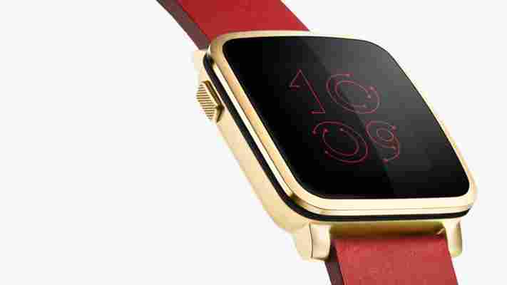
Pebble announced another new smartwatch at MWC 2015 today – the Pebble Time Steel – but with the Apple Watch set to come to market next month, there’s about to be another huge competitor on the market.

Nonetheless, Pebble’s CEO Eric Migicovsky told TNW that he’s not too concerned about the impending launch.
One of the ways that the two will be different is price. Apple hasn’t announced its final pricing yet, but it’s thought to be around $350 for the basic model Apple Watch, which could increase depending on your choice of strap or other accessories. Currently, the Time Steel can be reserved for $250, rising to $299 once the Kickstarter campaign ends.
Another of the ways that the two company’s devices are different is that Pebble also unveiled its interchangeable watch straps that allow third-parties to add in additional sensors (and therefore functionality) to Pebble devices.
This is a smart move from Pebble, not only does it make devices potentially upgradeable in future (or if a component fails), but it will also help grow Pebble’s pool of 26,000 developers that already build watch faces and other apps for the platform.
However, for now, Pebble is focused squarely on smartwatches, and has no plans for any other sort of wearable, according to Migicovsky.
Exactly what effect Apple’s launch will have on Pebble remains to be seen, but with a strong track record, wide-ranging developer support and ambitions to elevate smartwatches beyond mere companion devices, Pebble has a better chance than most in fending off the competition.
‘Space Black’ iPhone 7 case and screen images are making us drool
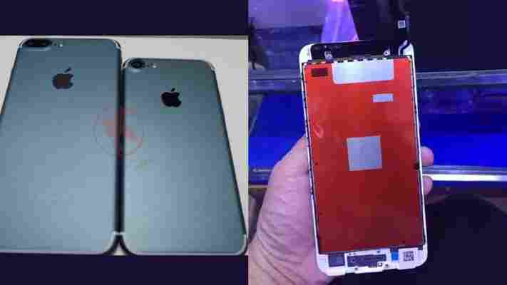
Forget gold-plated iPhones — that’s just stupid. The ‘Space Black’ iPhone 7 you actually want is floating around the rumor mill again, and it will probably have that ‘flat’ Home button we’re all excited about.

We’ve seen the Space Black iPhone before, and quickly fell in love. Then it flitted away after follow-up rumors, and our dreams were crushed .
Now it’s back, and considering how close we are to ‘iPhone season’ — this is starting to seem realistic. The pictures are grainy, and some show the Smart Connector we’ve been led to believe may not make the final cut (which could mean they’re photoshopped, or that Apple is making it an upgrade feature), but we’re still excited — especially because it has that dual-camera array we’re so interested in.
Better images show what’s being billed as a new screen assembly for the iPhone 7, replete with a flat Home button. As you can see in the images, there’s no cutout for Home button hardware, suggesting it will simply rely on haptic feedback (like the on-screen keyboard does) to let you know when it’s been pushed.
And if you’ve been keeping up with our iPhone 7 coverage, you know I’m about to tell you to be cautiously optimistic about all of this. While I’d absolutely love a Space Black iPhone 7 Plus with a flat Home button with dual cameras, I’ll temper my enthusiasm until we get the real thing.
