When a major supermarket chain announces plans to enter the tablet space, one’s natural instinct is to run for the hills. Or, at the very least, dismiss it as crap before it’s even gone to market.

And with the likes of Google’s Nexus 7 and Samsung’s Galaxy Note 8.0 already serving the portable tablet industry well, is there really room for another entrant, one from a brand synonymous with bread, beans, and bananas?
Sure, Tesco has long transcended its grocery roots in the UK, offering everything from insurance to a mobile network . But getting into the hardware game where all the cool kids hang? Well, it’s a bold move for sure.
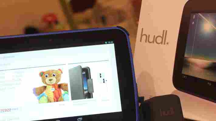
Our initial hands-on with the Hudl was largely positive , allaying concerns of yet another budget and inferior device entering the tablet fraternity. So we thought we’d get our hands on one of Tesco’s tasty tablets to give it a proper spin, and see whether it has what it takes to make tracks in the already-competitive tablet market.
Available in black, blue, purple and red, Tesco’s Hudl ships in a compact box replete with a micro USB cable and a wall-charger.
Now, in a clear sign that Tesco isn’t cutting corners to keep costs down, the charger is fully-branded and feels rather unique – certainly not the typical mass-produced cheapo you might find for $0.99 (+$5.99 shipping) on eBay, and which may be thrown in as an added extra with some of the other lower-end tablets on the market.
Branded chargers, compact boxes and a choice of four colors are all very well and good, but what you really want to know about is what’s under the hood, right?
Manufactured by Taiwan’s Wistron Corporation , the Hudl delivers a reasonably impressive spec list, certainly for its £119 price-tag. The 7-inch (diagonal) IPS LCD screen features an adequate 1440 x 900 HD resolution (242 ppi), and all this is underpinned by 16GB of internal storage, a 1.5GHz A9 quad-core processor and 1GB of RAM.
Juxtapose this against the Nexus 7, and you start to get a flavor of the level of bang you’re getting for your Hudl buck.
Indeed, the new 16GB Nexus 7 sports a marginally bigger 7.02-inch screen, with 1920 x 1200 HD display (323 ppi), and is powered by a 1.5GHz Qualcomm Snapdragon S4 Pro, and 2GB of RAM. While the Hudl has a 2MP front-facing camera and a 3MP rear-facing camera, the Nexus 7 has 1.2MP and 5MP respectively.
In terms of size, the Hudl is 128.8mm x 192.8mm x 9.85mm, compared to the 114mm x 200mm x 8.65 mm of the Nexus 7. So overall, the Hudl is slightly taller and thicker, but not quite as wide. And on the scales, the Hudl weighs in at 370g, compared to the 290g of Google’s tablet.
Given the Nexus 7 will set you back £199, you could be forgiven for thinking that the extra £80 you’re paying is going on the aforementioned spec-enhancements, but the Hudl actually has a few tricks of its own up its sleeve. These come in the form of a micro-SD slot that lets you expand the storage up to 48GB in total and – drum roll – a Micro-HDMI slot. Yes, you can hook your Hudl up to your TV and watch movies stored on your device, or stream from Tesco-owned Blinkbox, Google Play or any other similar service.
This is actually a very deliberate move on Tesco’s behalf – it’s trying to appeal to the general populace, and through bypassing the need to stream through other third-party boxes, it has made it easier for its tablet to become a feature in livingrooms across the nation.
It’s also worth mentioning the 16GB Kindle Fire HD here , which actually costs the same as the Hudl through Tesco. There are comparisons to be made for sure, but given Amazon’s reliance on its own app ecosystem, and it doesn’t serve up access to the likes of Google Maps and the Gmail app, it feels more natural to compare the Hudl with the Nexus 7.
The first thing you’ll notice when you pull the Hudl out the box is that it’s a very solid device – it doesn’t feel like a £119 tablet.
The extra 80g it has on the Nexus 7 is certainly noticeable, but given we’re talking such small units of measurement here, it’s not exactly a deal-breaker. You can easily slip the Hudl in a (large) inside pocket, or backpack and it will serve you well throughout the day.
The back of the Hudl is nice to the touch, sporting a soft, velvety plastic casing with the rear-facing camera in the top-right, and two 1w stereo speakers.
The sound quality from the speakers isn’t brilliant – it’s certainly passable – but not brilliant. Indeed, if you have a low tolerance threshold for tinny sound, then a good set of headphones or speakers will obviously bypass this. And given the price of the Hudl, there was always going to be some shortcomings.
The Hudl was evidently designed to work in landscape mode, given the positioning of the cameras and so on. And along the top edge is the micro-HDMI port, microphone and headphone jack, while on the bottom rim is the micro-USB port. Down the right-hand side, is the slot for the micro-SD card, the volume and the on/off button.
When you’re setting the Hudl up for the first time, you do get a sense that Tesco is going for the family market. There is a leaning towards protecting children, with one of the first screens offering advice on how you can take precautions for those using the Web and apps unsupervised. This is entirely optional, of course.
If you do take the advice, it basically guides you to one of the many parental control apps on Google Play, and suggests creating individual user accounts and filtering content, among other features enabled by Google and Android.
If there was any doubt that the Hudl was a Tesco device, confirmation is served up via the permanent [T] button in the bottom menu section. Hitting this takes you directly to the supermarket giant’s online repository, where you can buy anything from vitamins and vodka, to TVs and teddy bears.
Through the side-menu here, you’ll see a series of shortcuts to Tesco products, including Blinkbox movies and music. These are basically shortcuts to its native Android apps – read our review of Blinkbox for Android from earlier this year – and mobile-optimized Web versions of the various services, including Tesco banking.
This is an obvious move from Tesco given its investment in these services, as it moves further away from groceries into entertainment and general lifestyle services.
The Hudl runs Android 4.2.2 (Jelly Bean) out of the box, and it’s pretty much the sans customized incarnation of the operating system, though Tesco has thrown its own flavor of vanilla into the mix.
As we’ve seen with the child-centric guides at the start, the Hudl is very much geared towards novice users, and seeks to help them optimize their use of the tablet.
There are various promotional Tesco widgets installed on the homescreen too, though these can be deleted easily by long-pressing and shifting toward the little cross icon that appears at the top.
In terms of the first-timer-focused content, well, this covers everything from downloading movies and music…
…to getting the most from the installed camera. This includes snapping photos, editing and sharing.
The rest of the Hudl experience is pretty much as you’d expect from an Android tablet. It worked well for us in our tests, responded well to the touch and promises a long-battery life.
Indeed, Tesco promises ‘up to’ 9 hours of video playback from the Hudl, a figure that naturally varies on the playback conditions – screen brightness, video format, volume and so on.
I streamed an hour-long TV show on full-brightness, and there was more than 80% of the battery remaining. So in real terms, I’m sure the video playback would typically be closer to the 6 hour mark for most users, which is fine in itself. And obviously, if you’re just using it for browsing the Web, and checking the occasional email, there’s no reason why this couldn’t last you a few days in standby mode.
If you are shelling out for a Hudl, you’d also may as well go for the folding case/stand too, which comes in at a reasonable £15 , less than half what a iPad mini smart cover costs .
There’s no question the Hudl offers a compelling proposition for those looking to enter the tablet market in the UK. For the price (£119), it certainly punches above its weight and offers more than enough for Tesco’s main target market here.
Granted, it’s not quite up to speed with something like the Nexus 7, but it’s in the same ball park, and given the strength and reach of Tesco’s brand, I can’t see any reason why the Hudl won’t become a mainstay in homes around the country.
Then there’s this. If you’re a regular Tesco customer anyway, it’s actually possible to get your hands on a Hudl for as little as £60, using the Tesco Clubcard Boost initiative , which essentially doubles the value of your loyalty vouchers at the checkout. After all, every little helps.
➤ Tesco | Hudl
Microsoft releases three videos showing off how Kinect for Windows can work for retailers
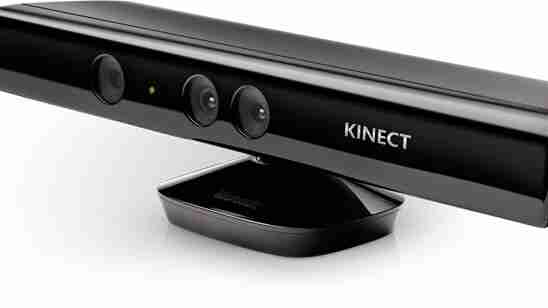
Ever since releasing the Kinect for Windows SDK, Microsoft has been updating it regularly with feature after feature. Today the company wants to get retailers excited about attracting customers by building interactive experiences with its tools.

It’s not clear if retailers just haven’t adopted Kinect like Microsoft would have hoped, or if the company wants to accelerate its growth. Either way, the Kinect team has developed the following three videos which attempt to show how Kinect for Windows experiences “can help retailers attract new customers and engage customers in deeper ways.”
Without further ado, here are the three videos along with their PR descriptions:
In my opinion, these videos are equally cool to watch for consumers as they probably are for retailers. That doesn’t mean they will necessarily work as intended, but I personally would at least try out these advertising “experiences” even though I almost always ignore all retail ads.
See also – Microsoft updates Kinect for Windows SDK with background removal, color capture, other new APIs and samples and Microsoft boosts Kinect for Windows availability by extending lower academic pricing to its partners
Top Image Credit: Microsoft
Sony Xperia Z2 hands-on: A promising rival to the Samsung Galaxy S5
Just six months after the Xperia Z1, Sony is back with another flagship Android smartphone. Given the short space of time that’s elapsed between the two announcements, it’s understandable that the Xperia Z2 offers small, understated improvements over its predecessor.

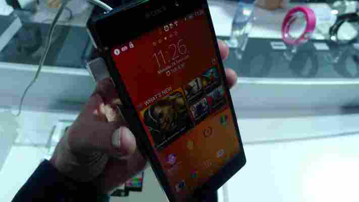
The 5.2-inch full HD (1080p) display is a fraction larger and brighter than the Xperia Z1, but the chassis that surrounds it looks almost identical. The new handset is a few millimeters taller and slightly thinner than its older brother, but in the hand these differences are barely noticeable. The Xperia Z2 offers the same ‘Omnibalance’ design found on the Xperia Z and from afar, it’s difficult to tell the two apart.
The formal, rectangular design isn’t particularly eye-catching, but it’s still attractive and comfortable to hold.
Instead, much of Sony’s focus has been directed at the components inside. The Xperia Z2 runs on a quad-core 2.3 GHz Qualcomm Snapdragon 801 processor, which is an improvement over the Snapdragon 800 found in the Xperia Z1. The RAM has been bumped up from 2GB to 3GB and the battery has been increased to 3200 mAh. All of these changes make the Xperia Z2 an incredibly capable smartphone.
While I haven’t done any benchmarking, the Xperia Z2 feels fast. Swiping through the Android interface and alternating between apps is buttery smooth, and it handles intensive tasks without complaint. The gains in computational power are clearly diminishing each year, but it’s liberating to use nonetheless.
Sony unveiled the Xperia Z1 at IFA last year partly because of its upgraded rear-facing camera. The 13-megapixel sensor had been swapped out for a 20.1-megapixel version which often offered better photos by downsampling the original image to an 8.3-megapixel file.
Six months later, the Xperia Z1 still offers one of the best smartphone cameras on the market. The Xperia Z2, unsurprisingly, opts for the same sensor with a few noticeable improvements on the software side. Sony now offers a ‘Timeshift’ mode for slow-motion video clips, background defocus for photos with plenty of ‘bokeh’ and a shortcut to Vine’s own camera interface.
Slow motion video worked beautifully and picking specific scenes to implement the effect was quick and intuitive. Most importantly, it doesn’t feel like a gimmick; I can see myself using it for all sorts of action shots, including the finish line at a bike race, a spectacular stage dive at a concert, or my baby cousin’s first steps. Although the feature isn’t unique – Apple offers slow-motion video with the iPhone 5s – I’m still impressed by the results.
In contrast, the background defocus effect was inconsistent. Perhaps it’ll be better suited to macro photography, but some brief test shots at Sony’s booth proved too much for this particular mode.
The Xperia Z2 also introduces ultra high definition (4K) video recording at 30 frames per second, with its SteadyShot image stabilization technology for smooth footage. A trade show booth isn’t the best place to test this feature, but all of the videos I shot were clear, detailed and with accurate color representation.
If you value the camera experience in an Android flagship, the Xperia Z2 appears to be an excellent choice.
Elsewhere, Sony has kept the software experience fairly similar to the Xperia Z and Xperia Z1. Aside from the recent Motorola devices, it’s undoubtedly one the closest skins to stock Android – which is fantastic.
Sony offers a number of its own entertainment apps, including Music Unlimited, Video Unlimited and PlayStation Mobile, but they’re easy to ignore and pleasant enough if you want to switch across to its various digital storefronts.
There are some basic widgets that can be pulled out from the app switcher and there’s a new app called “What’s New” that suggests films, music, TV shows and video games you might want to check out. It can be launched with a long press on the home button – just as you would to open Google Now – and reinforces Sony’s focus on delivering and selling multimedia content.
If you want to shut out the masses on your daily commute, the Xperia Z2 is also equipped with digital noise cancelling (DNC) technology. It’s been optimized for Sony DNC headphones, although some third-party models will also be supported. The impact is immediate and should prove useful when you’re desperate for a little piece and quiet.
The differences between the Xperia Z1 and Xperia Z2 are marginal. Nevertheless, this is one of the most impressive flagship Android smartphones that I’ve picked up this year – all of the core components have been improved and I was impressed both by the camera and the subtle software experience.
While I would have liked Sony to experiment more with the Xperia Z2’s industrial design, it’s still a nice looking piece of kit. If you’re a fan of the ‘Omnibalance’ aesthetic that Sony is always pushing, the Xperia Z2 looks to be another first-rate handset.
Gallery:
