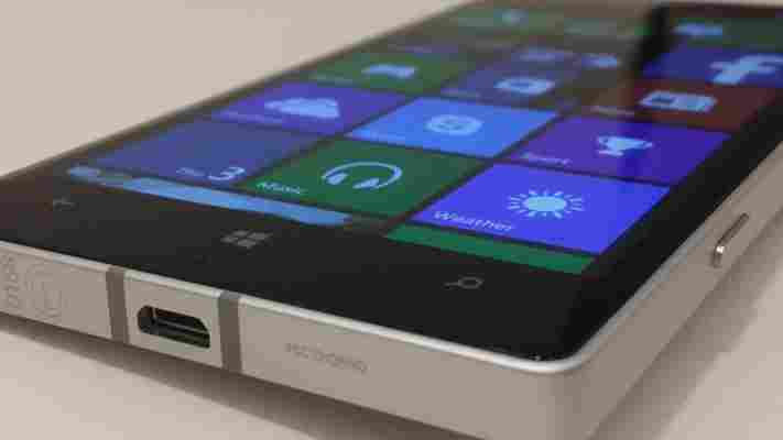
Microsoft announced a whole slew of updates and new product details at its Build conference yesterday, but tucked among the Windows 8.1 and Windows Phone 8.1 announcements was a new high-end Lumia 930 smartphone, alongside two other lower-end 630 and 635 devices.

Unlike the Nokia X device revealed at Mobile World Congress this year, the new Lumia additions all run Windows Phone 8.1, rather than a customized version of Android.
With momentum, particularly in Europe, now moving in Nokia’s favor and an ever growing number of Lumia devices being sold, the company is looking to capitalize on its progress by offering a number of accessories included in the retail price of the device, such as including a wireless charger in every box.
Although it uses the Microsoft Windows Phone 8.1 OS, it has taken some cues from the Nokia X in some sense – it’s considerably squarer to look at and hold than the rounded curves mostly found across the rest of the high-end Lumias, like the 1020 or 925.
As you’d expect from its numbering, the Lumia 930 feels like more of a successor to the Lumia 925 than it does the 1020 – it shares a more similar overall design, and has a colored shell for the rear panel in the same way as the 925. It’s also a step up in the camera from the 925 (which had an 8-megapixel snapper), whereas the 1020 actually still boasts more megapixels.
The Lumia 930 offers up a full HD (1080p) 5-inch OLED display (both the 925 and 1020 offered 4.5-inch 720p displays), quad-core 2.2GHz processor (which showed no signs of lagging), 2GB RAM and 32GB of on board storage – although this can obviously be bolstered by cloud storage (OneDrive still offers 7GB of free storage for new users), there’s no microSD expansion option. Nokia also wouldn’t say if it would be offering a 64GB version in the future.
There’s also a 20-megapixel camera with OIS (optical image stabilisation) and Carl Zeiss optics. Unfortunately, in our short tests, it was hard to ascertain the quality of the snaps in our (indoor) testing. Nonetheless, Nokia has successfully made a bit of a name for itself with the cameras on its smartphones, so we fully expect a more detailed dive in a full review to yield good results.
Many of the newest features for the 930 are ones afforded by changes to the core software, rather than hardware tweaks. The message coming from both Nokia and Microsoft around this launch focuses on integration and cross-platform convergence.
On the home screen, for example, there’s now the option for an extra row of icons and the ability to set a custom image as your backround.
Thanks to Windows 8.1 and Windows Phone 8.1 syncing options, which ensure that any devices registered to the same Microsoft email address share passwords, history, apps and more across devices, there’s also now the option to share your Start screen image across devices too.
It’s actually quite a nice effect if you set your own Start image, as some of the Live Tiles appear transparent to allow you to see the image behind.
The other biggest change is the addition of a notification panel at the top of the screen. As with Android, just pull down from the top to reveal quick access to frequently used settings, and the option of clicking through to the full options screen.
There’s also a pretty impressive Swype-like keyboard too that’s about as accurate as any I’ve seen and as fast as you could want. A definite improvement over the previous stock Windows Phone keyboard.
Also on board is Internet Explorer 11, which will now pull in your favorites from any tablets or PCs running Windows 8.1 as well as easily allowing you to pick up and carry on browsing sessions across different devices.
There’s also password syncing across devices too – and an option within the OS for easily sharing WiFi passwords with friends or family.
Other Nokia apps like MixRadio, Xbox Radio and XBox Video are also on board, alongside its range of camera-specific apps and features like Storyteller .
Due to ship at the end of June in white, orange or green, the Lumia 930 is a collection of minor hardware tweaks – there’s nothing too revolutionary in comparison to other Lumia handsets, so if you were hoping for an all new handset redesigned from the ground up, you could well be disappointed.
However, that’s not to say that it has nothing new to offer – it’s just that most of this is enabled through software updates that will be rolling out to other Lumia devices when Windows Phone 8.1 starts to roll out to older handsets.
With no pricing details revealed as yet, it’s hard to say whether the Nokia stands much of a chance of attracting consumer attention – it’s a busy marketplace, and among the Lumia brand alone there are a number of handsets to choose from. However, with a more converged platform powering the device and a full HD display and gutsy quad-core processor keeping it all ticking along, it looks like it could be a solid contender for anyone considering a high-end Nokia.
Hands-on with Microsoft’s $499 Surface 3, arriving May 5 sans Windows RT
Windows RT, Microsoft’s Windows 8 spinoff that only ran touch-friendly apps, kinda sucked .

The Surface and Surface 2 it powered were admittedly nice pieces of hardware, but the ecosystem of touch apps just wasn’t there. Windows RT couldn’t escape the shadow of legacy applications, so the people who did buy a Surface gravitated to the more powerful – and more expensive – Pro serie s to run ‘real’ software.
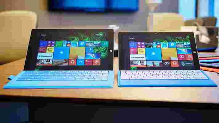
Enter Microsoft’s new $499 Surface 3, available for preorder today and due for release May 5.
This time it’s running full-fledged Windows 8.1 – Windows 10 is a free upgrade upon release this summer – meaning Windows RT has once and for all disappeared into the aether. Good riddance; this is a real laptop.
…Or tablet, I guess. The dichotomy of the Surface line is as present as ever here, but there’s no question the Surface 3 makes more sense as a tablet than the Pro model .
Most obviously, it’s smaller. It’s not quite as diminutive as that rumored 7-inch Surface Mini would have been, but the 10.8-inch screen immediately makes it better suited for toting everywhere than the 12-inch Pro. It also serves to separate the two lines clearly; previously both models shared a 10.6-inch display.
Like its larger brothe r, the Surface 3 has mercifully made the transition to a 3:2 aspect ratio display – photographer-friendly and much better for any vertical content – which comes in at a 1920 x 1280 resolution. That’s a sharp 214 ppi, and at first glance color reproduction seems on par with the Pro’s excellent display.
Microsoft, thankfully, didn’t cut corners with the build either. It actually took me a moment to realize I was holding a new, smaller device when it was handed to me. The materials are virtually identical. That’s a good thing, and in some ways it one-ups the SP3 too.
It’s a wee bit thinner and lighter, for instance – 8.7mm thick and 1.37 pounds (622 grams). Granted, it’s not giving the iPad Air 2 a fight (6.1mm, 437g), but it slightly beats out older models like the third gen iPad (9.4mm, 662g).
There are also no fans this time around, so it runs silently. In fact, the only gaps in the chassis are the ports and the Dolby-powered speakers. For you tablet photographers, there’s an auto-focusing 8MP camera on the rear and 3.5MP shooter in the front.
There’s a shiny new Microsoft logo on the back now, a notable design departure from previous hardware and replacing the old etched “Surface” text. The company recently found that ‘Microsoft’ branding performs better than its individual product names, so the move isn’t totally surprising. Besides, Microsoft probably feels a little left out from the sea of glowing half-eaten apples in college lecture halls.
My favorite hardware update on the Surface 3 might actually be the subtlest though: the new Type Cover. Like the one for the SP3, it magnetically latches to the display’s bottom bezel to set the keyboard at an angle, but the typing experience is somehow better on the smaller device.
The keys are still full-sized and backlit, but Microsoft says their clickiness factor has been upgraded to more satisfactory levels while simultaneously being quieter. Travel was still a bit shallow, but both those claims proved true in my side-by-side tests.
The new keyboard also flexes less; whether that’s because of internal reinforcement or simply being being smaller, I don’t know, but I’m not complaining. I’m still not sure the Type Cover can compare to some of the better ultrabook keyboards yet, but it’s an improvement over the SP3’s version and miles ahead of the one on the Surface 2.
On the other hand, the trackpad is a little smaller to match the display, but Microsoft says it’s more responsive now. I didn’t immediately notice a difference in my time with it.
My other favorite thing is the new Surface Pen. Okay, it’s not really new. It just comes in red, blue and black in addition to silver now, and I really want a blue one. Colors!
The company did have to make some compromises with the kickstand though; there are 3 positions this time around. That’s one step more than previous Surface models (it’ll now lay nearly flat for drawing), but definitely a downgrade from the SP3’s full range of motion. Apparently the mechanism on the Pro is larger and more complex than the design team could afford on the smaller device, but it still makes me a bit sad.
Moving underneath the chassis, the internals are unsurprisingly entry-level. The $499 base configuration nets you just 2GB of RAM (ugh) and a 64GB SSD (expandable via microSD). The only other configuration is a $599 build that bumps things up to a more reasonable 4GB of RAM and 128GB, but otherwise has identical specs. There’ll be an LTE version later this year that’ll run on Verizon and T-Mobile in the US, but Microsoft’s not revealing anything else about that model yet.
That said, the Surface 3 might have a temporary performance advantage over competitors by being the first to use Intel’s new quad-core Atom x7 processor, dropping the old ARM chipsets in favor of x86 architecture. The x7 runs at a base 1.6Ghz clock speed, and can crank up to 2.4Ghz when needed. The main bullet point for the Cherry Trail chipset, however, is graphics performance; Intel is claiming a 2x improvement over the previous generation.
In our brief trial, applications loaded snappily and navigation throughout both the Modern UI and desktop interfaces was smooth. We only had one or two programs open though; we’ll see how that 2GB of RAM fares once we start loading up those all those fancy Project Spartan tabs.
All that hardware should net you 10 hours of video playback battery life, according to Microsoft. Hopefully that translates to decent workday longevity, as even my Netflix binges aren’t quite that long.
Your port selection is pretty much the same as on the Surface Pro 3: a headphone jack, singular MiniDisplay and USB 3.0 ports, and a microSD slot. A $199 dock with 4 USB ports and Gigabit Ethernet will be made available after launch.
Charging it will be a bit more convenient now too; the Surface is replacing the proprietary adapter with a high-power Micro USB port. When I asked why it didn’t go the USB-C route, a la new MacBook and Chromebook Pixel , Microsoft simply told me it wants you to be able to charge your device anywhere. You lose the magnetic plug, but in return can use your phone charger if you forget the Surface’s.
All things considered, my first impressions of the Surface 3 are refreshingly encouraging, with a few qualms.
In particular, Microsoft still doesn’t include the Type Cover ($129) and Surface Pen ($49) at the base price. I get that it wants to offer choice, but the touch-only app selection just isn’t very strong for most users and likely won’t be for a while. I’ve never seen a Surface in the wild without at least a keyboard cover, so that effectively brings the entry price up to $628. I’m also still wary about how 2GB RAM will fare on full Windows, even at $499. But hey, it includes a 1-year subscription to Office 365 and 1TB of OneDrive storage, so I guess that’s something.
Still, by not crippling it with underpowered software, the cheaper, more portable Surface instantly becomes a better value than its predecessors. Microsoft might just have a fighting chance at getting its shiny new logo into college classrooms and Starbucks coffee shops everywhere, and the party doesn’t even really start until Windows 10 rolls around.
We’ll be running the Surface 3 through its paces soon to see how it holds up in the real world; stay tuned for our full review.
➤ Microsoft Surface 3
Read Next: Everything Microsoft Announced at its Windows 10 Event ; Microsoft Surface Pro 3 Review
Samsung launches $19.99 Power Sharing cable for charging micro USB devices with your Galaxy phone or tablet
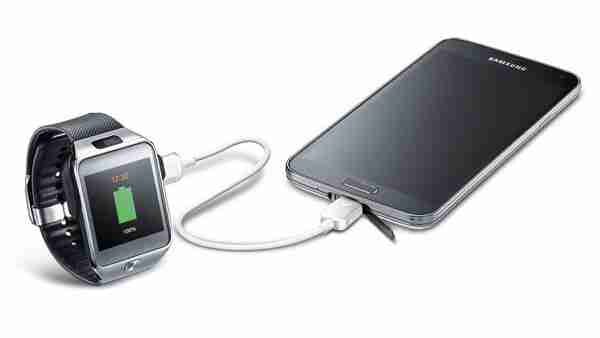
Samsung today launched a new accessory for its Galaxy line of products that isn’t just a gimmick but looks extremely useful: meet the Samsung Power Sharing cable for $19.99. In short, the cable lets you use select Samsung Galaxy phones and tablets to charge your other micro USB devices.

Samsung lists the following compatible devices for being able to share power: Galaxy S 5, Galaxy Tab S 10.5, Galaxy Tab S 8.4, Galaxy Alpha, Galaxy Avant, and Galaxy Note 4. Thus if you bought a Galaxy device this year, you’re good to go. As for receiving power, Samsung promises that the cable is compatible with “any device that can be charged via Micro USB cable” (that means smartphones and tablets, but also wearables and Bluetooth headsets).
The company does warn that there are limitations to the process, which requires Samsung’s Power Sharing app for Android. The full battery amount on your Galaxy device “cannot be transferred due to power loss or usage during the transfer process.” Nonetheless, if you can’t find a power outlet, and you don’t have a spare battery, this cable turns your Galaxy device into a savior.
See also – Samsung Galaxy S5 review: Incremental is the new cool and Hands-on with Samsung’s 8.4-inch and 10.5-inch Galaxy Tab S: Thinner and lighter than Apple’s iPads
