When Evernote launched its marketplace for product collaborations in September, the store included a Jot Script stylus from Adonit that had been designed to take advantage of its Penultimate handwriting app.

At $74.95, the Jot Script Evernote Edition is more than most of us would pay for a stylus, but for those who are really into their styluses, the palm rejection and precision Bluetooth features justify the price.
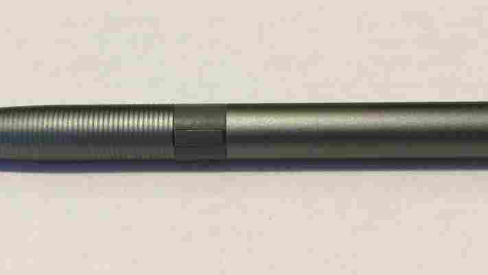
The Jot Script requires a AAA battery. A nondescript button halfway down the barrel of the stylus activates the capacitive nib. Evernote doesn’t specify this clearly on its product page, but you’ll need an iPad 3 or later to really take advantage of the stylus because it uses Bluetooth Low Energy 4.0.
Adonit also lists the iPhone 5 as compatible, but that won’t do much for you at the moment, since Penultimate is currently the only app that integrates with the Jot Script over Bluetooth, and it’s not available on the iPhone.
When I tested the Jot Script on the iPad 2 and the Surface 2, it worked okay without the Bluetooth integration, but I definitely wouldn’t recommend buying the stylus unless you have a newer iPad that can take advantage of the extra features.
The stylus works fine in apps other than Penultimate, but you’ll miss the palm rejection and extra precision. Here’s what it looks like in Paper by FiftyThree:
Syncing the Jot Script with a compatible iPad is easy. Make sure you have the most recent version of Penultimate (version 5.0 or later) and find the Jot Script option in the general settings pane. Turn on your stylus and the iPad quickly finds it.
To get the most out of the stylus, you’ll want to turn on the wrist protection feature in Penultimate and then specify the position you use when writing. I prefer to write with my hand resting on the writing surface, so the extra palm rejection made writing with a stylus much more usable.
The Jot Script’s point is 1.9mm, which feels much more like a pen point than many of the crayon-sized styluses on the market. It doesn’t have a lot of resistance on the screen, but it’s accurate and fast.
As with other handwritten entries in Penultimate, Evernote will scan your writing and make it searchable. I’ve had mixed success with this, but you should know that I almost failed out of second grade because my handwriting was so poor.
Most of us can type faster than we write, even on a virtual keyboard, but there’s still something very appealing about having the freedom to write and sketch by hand. The Jot Script, combined with Penultimate’s zoom and drift features, makes for the best stylus experience I’ve found yet on an iPad. Just keep in mind that the Bluetooth features only work on an iPad 3 or later.
➤ Jot Script Evernote Edition Stylus
See also: The future of handwriting and The 10 best writing apps on the iPad
iPad Air vs. iPad 4: What has Apple changed?
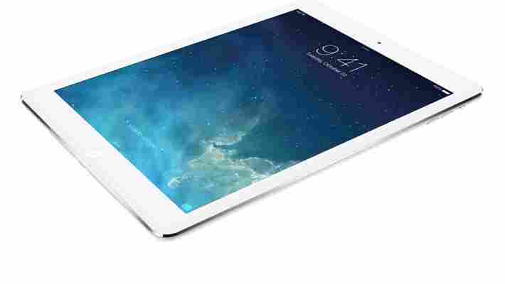
At its October media event in San Francisco, Apple today announced the iPad Air , the successor to the iPad 4. After all the rumors and leaks, Apple’s fifth 9.7-inch tablet is finally official.

Before you run out and buy it, assuming you’re not interested in Android or Windows 8, you might want to see what you’re getting for your hard-earned cash. As such, we’ve put together a table to show you what exactly Apple has changed.
| iPad 4 | iPad Air | |
|---|---|---|
| Storage | 16GB, 32GB, 64GB, 128GB | 16GB, 32GB, 64GB, 128GB |
| Price | $499, $599, $699, $799 | $499, $599, $699, $799 |
| Price with LTE | $629, $729, $829, $929 | $629, $729, $829, $929 |
| Display | 9.7-inch, 2048×1536, 264 ppi | 9.7-inch, 2048×1536, 264 ppi |
| Processor | Dual-core A6X | 64-bit A7 |
| Rear Camera | 5MP, ƒ/2.4 aperture | 5MP, ƒ/2.4 aperture |
| Video Recording | 1080p | 1080p |
| Front Camera | 1.2MP photos, 720p video | 1.2MP photos, 720p video |
| FaceTime | Over Wi-Fi or cellular | Over Wi-Fi or cellular |
| Assistant | Siri | Siri |
| Bluetooth | 4.0 | 4.0 |
| Browsing time on cellular | Up to 9 hours | Up to 9 hours |
| Browsing time on Wi-Fi | Up to 10 hours | Up to 10 hours |
| Height | 9.50 inches (241.2 mm) | 9.4 inches (240 mm) |
| Width | 7.31 inches (185.7 mm) | 6.6 inches (169.5 mm) |
| Depth | 0.37 inch (9.4 mm) | 0.29 inch (7.5 mm) |
| Weight for Wi-Fi | 1.44 pounds (652 g) | 1 pound (469 g) |
| Weight for LTE | 1.46 pounds (662 g) | 1.05 pounds (478 g) |
| Connector | Lightning | Lightning |
| Colors | Black, White | Space Gray, Silver |
Given that the iPad Air’s pricing remains unchanged from the iPad 4, you’re basically paying the same amount for a lighter but more powerful tablet. The iPad Air ships on November 1 in 41 countries . Will you be getting one?
See also: Everything Apple announced at its October event in one handy list
Top Image Credit: Apple
Surface Pro 3 first impressions: Third time’s almost the charm
At the New York press event for Microsoft’s Surface Pro 3 today, CEO Satya Nadella and Surface Corporate Vice President Panos Panay touted the company’s mission to replace the laptop with a tablet.

This is a claim Microsoft has made for its past Surface launches. So did the Pro 3 deliver this time? Here are our first impressions.
One of the first noticeable upgrades from the Surface Pro 2 is the Pro 3’s 12-inch screen and thinner body. At 9.1mm thick, the Pro 3 weighs in at 800g (1.76 pounds) – almost half of the 13-inch Macbook Air’s 1.35kg (2.96 pounds). The device is light enough to hold in one hand and use like a tablet, though I can’t imagine you’d be able to hold for too long.
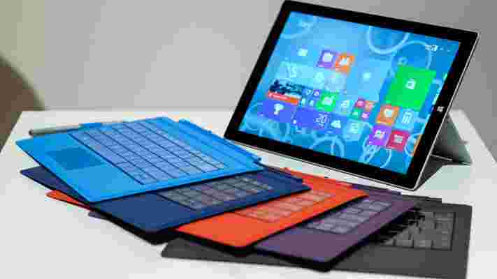
The physical looks of the Pro 3 are also a nice upgrade from Pro 2’s clunky, all-black body. The Pro 3 features angular edges, matte aluminum finish, a “friction-hinge” kickstand and a magnetic attachment to stabilize the keyboard to the front of the Pro 3’s screen. They’re all part of Microsoft’s attempt to make the Surface more lap-friendly, which certainly helped. The magnetic strip made the Surface keyboard less wobbly, though the thinness of the keyboard-cover combo still made it a bit bouncy to type on.
Speaking of the keyboard, I enjoyed the Type Cover ‘s subtle improvements. The seamless click attachment lets you work uninterrupted, and the trackpad is now 63 percent bigger than its previous version. As you can see in the picture above, however, the pad is a bit off-center, which might not please left-handers (like yours truly) too much.
Even with the larger size, the trackpad is pretty small even for my petite hands, and I found that my thumb often got in the way of the index finger while scrolling around. It’s best if you train yourself to primarily use your index finger to both scroll and click to get accustomed to the Pro 3 keyboard’s real estate.
The worst part of cracking a brand new device open is the set up process, and sad to say, Microsoft’s rendition of this tedious procedure did not impress. Maybe it was the poor Wi-Fi in the press room, but it took nearly 10 minutes for the Pro 3 to launch and install apps before it even got to asking what I’d like to name my device. Why aren’t the basic apps pre-installed and ready to go?
Another small gripe: Syncing your Microsoft account with the Pro 3. I understand this is standard procedure, but when I selected “I can’t do this right now” to skip the confirmation process, the Pro 3 would bypass the page only to ask me again to log into my secondary email to confirm the account.
In an era where we’re used to downloading apps and setting up online accounts in 30 seconds or less, the Pro 3 onboarding process was infuriating, to say the least.
Once the device was finally up and running, I was impressed with Windows 8.1’s speed. The swipes and gestures registered smoothly, and the stylus offers great accuracy in both writing and touch modes.
One of the cool things about the stylus is the ability to click the top like you would with a pen and write on the Pro 3 to automatically launch OneNote. It’s a nice feature, though it would be cool if you could also wake the device up using just the stylus click in case you didn’t need OneNote. An extra $49 to replace the ten natural styli you’re born with seems a bit excessive even if the click-to-launch-OneNote capacity is neat.
The Pro 3 also comes with optimized gestures for apps like Adobe Photoshop, which will allow you to pinch to rotate or maneuver around an image. This is a great feature that lets you create more intuitively and edit the finer details on the go, and the capacity will surely open more doors for other app developers to take advantage of the new gesture controls.
It’s clear Microsoft made loads of improvements to the Surface Pro 3, though it is, at first glance, still a far cry from the Macbook Air. We liked the processing speed of Windows 8.1 and the improved trackpad is nice, but it’s still a bit too tiny to comfortably perform gesture controls.
The addition of features to help make the Pro 3 more usable in portable settings is also well-intentioned, we’re just not sure how many people aim to use their laptops primarily on their lap.
Microsoft made it a point to call the Macbook Air its primary competitor, but honestly, the Surface Pro 3 seemed more like a fair rival to the iPad. And at $799 for the Core i3 version without the keyboard, it’s a tough price tag to swallow.
The Surface Pro 3 will be available in US and Canada on June 20 , with an international release in August. Pre-orders start on Wednesday at midnight ET.
