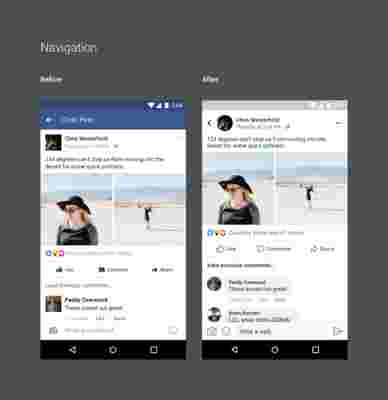
Facebook has updated its mobile app. Specifically, its main interface has been redesigned for a cleaner and clearer look. Broadly speaking, you can say goodbye to Facebook’s iconic blue bars and squares.
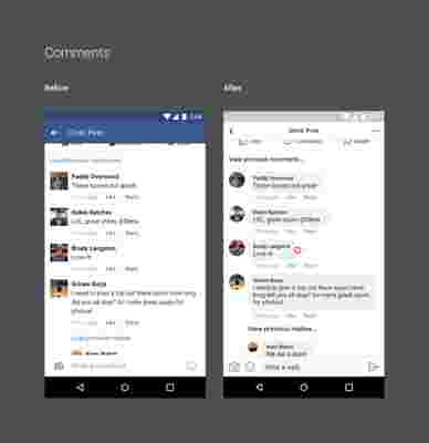
In addition, comments have also changed and now look like conversation messages, just like on Facebook Messenger. Each comment is found within its own gray bubble so it’s easier to see who has said what.
The “Like,” “Comment” and “Share” icons now have a more streamlined look. Also, they’ve been made larger so it’s easier to “get it right” when clicking them.
Since a picture is worth a thousand words, here you’ve got a before and after shot:


On their Medium blog Facebook said, “We did not want to just ‘fiddle at the edges,’” As well as including other minor details the social media giant pointed out that, “We wanted to make something that billions of people use every day less frustrating.”
More specifically, Facebook made all these changes by asking these questions:
“How might we improve News Feed to be easier to read and distinguish key areas of content?” “How might we make the content itself more engaging and immersive ?” “How might we make it easier to leave feedback ?”
Facebook has made it clear that nothing is ever “done” regarding its products. It is a constantly evolving process and its team is always looking for areas of improvement.
If your Facebook feed looks the same as always, remember that this is a gradual update. It’ll be implemented in your country/region in a matter of time.
