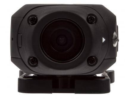
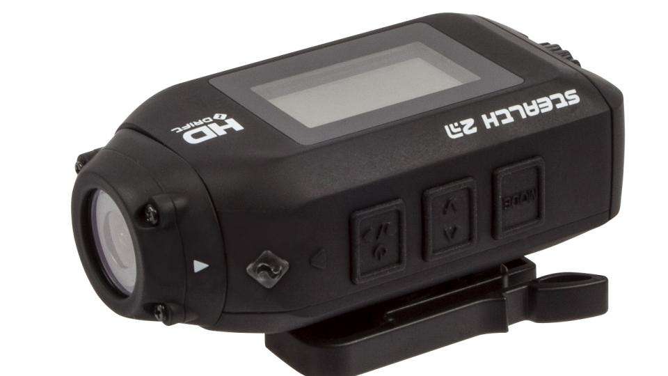
The Stealth 2 doesn’t deviate far from Drift’s previous action cameras – instead it shrinks everything down to make it the smallest model in the line-up. At 80x42x27mm it isn’t the most compact action camera we’ve reviewed but it’s still far from chunky. At just 97g, it’s not too distracting when mounted either.
The squat design brings certain benefits, such as a low centre of gravity that allows it to be stably mounted to a number of surfaces. It also has a lens that rotates through 300 degrees, which means it can be versatile in how it’s mounted, such as either on the side or top of a helmet. Markings on the lens helps you to orient the camera correctly.
In its default position, the lens is rotated so it’s flush with the body, but this actually has the camera’s perspective sideways when the camera is mounted horizontally. This is the same with Drift’s other cameras and we found it a little unwieldy. Typically the most common way to mount an action camera is horizontally, such as on top of a helmet, so you’ll need to remember to rotate the lens before you record.

The Stealth 2 is also intended to be an entry-level alternative to existing Drift cameras. While the Ghost-S could shoot in 1080p at 60fps, the Stealth 2 can only manage 30fps at the same resolution. In terms of slow-motion footage, you’ll need to drop down to WVGA (848x480) resolution to get 120fps.
Other sacrifices have been made as well, such as shrinking the LCD display to 1.3in, switching to monochrome and losing live view. It’s used purely for operating the camera’s menus. The LED backlight, which glows a different colour based on which mode the camera is in, is a welcome touch though. It glows green when shooting video and blue when in photo burst mode, providing at-a-glance feedback and helps you to avoid shooting still images when you want video.
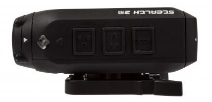
A Mode button for switching operations, scroll button for navigating the menus and a multifunction power and record button are found on the side of the camera. Having only one button to move through menus is tedious, as you can only scroll one way through long lists, meaning you have to scroll back round again if you miss the option you're after.

Disappointingly, few camera settings are duplicated on the smartphone companion app, meaning you're forced to use this laborious menu system. You can’t even set the time and date, even though a menu item shows what the camera is currently set to. The app is otherwise functional, but there's about a two second delay between reality and what's displayed in the live view. Annoyingly, while you can toggle between video and still images through the app, you have to reach for the camera to trigger a time-lapse.

