With Christmas fast-approaching, you may be starting to sweat (figuratively speaking) over what to get your loved ones. An Xbox One? PS4? Pair of socks? Well, if none of the above take your fancy, there’s always smart building blocks.
Following an uber-successful Kickstarter campaign that saw Seamless Toy Company raise almost 200% of its $100,000 funding goal, it finally launched ATOMS commercially last month.
At this juncture, it’s probably worth noting that Seamless also went on to raise venture capital backing prior to the public launch, which included former Apple executives and U2 frontman Bono . So it’s fair to say there’s high expectations around this company.
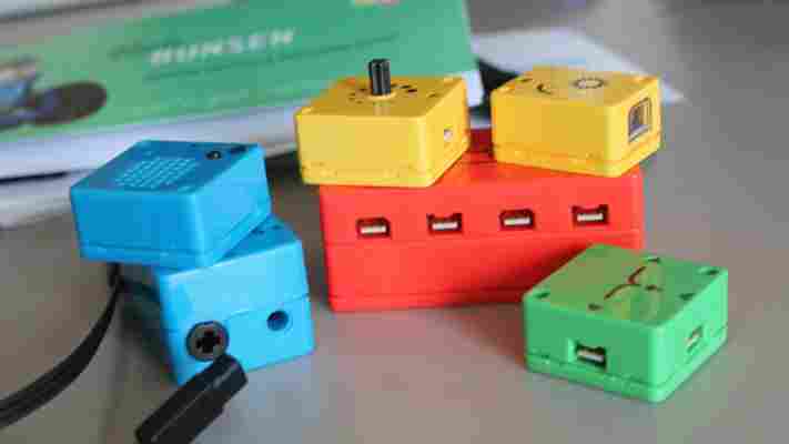
ATOMS are essentially a system of plug-and-play sensors, motors and logic blocks, aimed at children and adults alike. Different colors represent different functions – yellow bricks sense things (e.g. detect movement), red bricks ‘connect’ (e.g. power things), green bricks are all about ‘logic’ (e.g. they affect the outputs) and blue bricks are concerned with action – in other words they ‘do’ things.
You can procure individual blocks and construct your own creations, or you can buy starter sets which range in price from $40 to $120. There are four kits at the time of writing.
We managed to get our hands on a Bunsen Set , which is a so-called ‘Scaredy Quark’ that can be afraid of light, and is also prone to being clumsy.
The Bunsen Set ships with a light sensor, control knob, battery, splitter, motor, and audio recorder. While it’s apparently aimed at those aged 6 years and over, based on our initial tinkerings we doubt anyone that young would be able to construct this without a lot of help from an adult or older sibling. That’s not to say it was difficult to build per se , it’s just that it does require paying a lot of attention to the instructions which aren’t always that clear to follow.
Out of the box you get a lot of individual parts, including blocks, cables, cards…and the shell of a robot that’s broken down into multiple pieces.
If you’ve ever assembled a flat-pack desk or cabinet, you’ll know that it requires a lot of checking of screws and bolts to ensure the right number of the correct kind are present. Well, with this ATOMS kit, it’s really much the same (though maybe not quite as extreme) and it’s not always clear from the illustrations in the manual what’s what and where it should go. Some of the parts look very similar, which is why photos rather than illustrations would perhaps have helped here.
With a fully-charged (via USB or wall charger) red brick, you can start experimenting by connecting the blocks without actually building the robot. You have to ensure the arrows on the end of the cable and the blocks are facing the same direction, so the outputs are connecting to the inputs on other blocks.
Without the kits, there’s no real application which is why it will be better for many to actually put these blocks into objects such as this little robot, as it helps bring context to something that would otherwise be fairly arbitrary. This is actually a lesson for many technical subjects from programming through to physics – theory is harder to grasp when it’s not put into practice.
It took me about an hour to build the little Scaredy Quark, following the instructions to the very letter.
The instructions for building this little fella omit to tell you during the construction process that you won’t be able to connect the wires when it’s assembled.
Indeed, as soon as you reach the ‘You Did It!’ page in the booklet, congratulating you on finishing your work-of-art, it follows this up with a ‘tips’ page for connecting the wires. The first tips include: “ Remove the Tail and the Battery “…” Take the two halves of Bunsen apart “…” Slide the Battery out of Bunsen ” and more. In other words, you have to undo your good work to actually make this usable.
Yes, it’s a minor grumble, but having fumbled and followed instructions attentively for an hour, it was a little disheartening to read that I would immediately have to pull some of it apart to make it complete. Anyway, that’s what I did.
That all said, the ATOMS kit we used was great. The set in itself may not be essential , but it definitely helps you grasp what it is you’re actually doing. For example, the built-in voice recorder means you could record a ‘snoring’ noise which is activated when you pull the visor down over the bot’s eyes. Or you can hide it somewhere (e.g. a dark cupboard) and make it blurt out a noise (“Aaaaggghhhh”) when someone (your mum?) opens the door.
This ties in with the light sensor that comes with the Bunsen Set. It may seem a little bit ‘ whatevs ‘ without the context of the kit, but when used as a robot’s eyes for example, you can make it move backwards as you shine light into it. Conversely, you can make it move towards the light.
It’s also worth adding here that these have been designed so they can be placed in other kids toys (e.g dolls), sewn into clothing and attached to LEGO blocks. Take the Wave Wand Set , a kit that includes an exploding brick. So you potentially could bring a LEGO house to life by ‘blowing it up’ from the inside, triggered perhaps by the flash of a camera.
An ATOMS iOS app is also in the works – it’s expected to go live later this month. The Pascal iOS-controlled Robot Kit will actually require this app, connecting via Bluetooth to help you drive the motor, snap photos, measure how much light comes in through the sensor, and more. While Pascal is the primary kit that will use the app, other kits will also be able to tap the app if the creator chooses to include the Bluetooth brick in their specific project.
The only real limitation with ATOMS is the imagination of the builder. Also, as noted already, I’m not entirely convinced these will be of benefit to 6-year-olds without a lot of help from mum and dad, though perhaps I’m doing a massive disservice to the smartness of kids today.
Some of the kits are open for orders now and will ship in time for Christmas, but it’s on a first-come-first-served basis. Meanwhile, if you like the concept behind ATOMS, you may also wish to check out LittleBits , which offers an open source library of electronic modules that mesh together with magnets to help users learn and prototype.
➤ ATOMS
Oppo R7s review: Not the obvious choice for a mid-range Android, but ColorOS elevates it
Oppo isn’t a particularly well-known name in many Western markets, and that’s hardly surprising considering the Chinese company hasn’t been around for as long as the bigger players. What it is known for is offering ‘bang for your buck’, and its latest R7s model is no different.
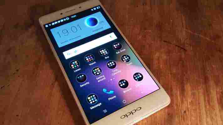
Priced at $399, it sits as a midway point in Oppo’s range – between the R7 and the R7 Plus – and goes up against similarly priced devices like the OnePlus 2, HTC One A9, and Nexus 5x, to name just a few.
It’s a busy space, and with little brand recognition, the R7s Lite has an uphill battle to fight to break through into the mainstream.
The R7s’ design is one of its stronger points. The OnePlus 2, for example, can’t boast the same unibody metal chassis design as the Oppo.
It’s thin too, at just 7.5mm thick, which is the same as Huawei’s Mate S, 0.4mm thicker than an iPhone 6s, or 0.1mm thinner than an iPhone 5s.
From a distance, if you squint, you could be forgiven for thinking you were looking at the front of an older generation iPhone, but then that’s a criticism that can be levelled at some other devices too – and so hardly holds the R7s back.
It’s only available in the ‘rose gold’ color scheme too.
Ultimately, it feels like a premium device in your hand, without weighing too heavily in your pocket (it’s 155 grams) and that’s not always easy to achieve.
The slimline design and metal construction did make it feel quite droppable, so using the included transparent case might be a good idea if you want to keep it scratch-free.
The display is a 5.5-inch full HD AMOLED touchscreen that uses Gorilla Glass 4 and offers 401PPI (Pixels Per Inch). That’s the same as an iPhone 6s Plus, and more than the iPhone 6s’ 326PPI. If you care about screen specs above all else, but are working with a slightly constrained budget, you could certainly do worse than the Oppo’s.
On the rear is a 13-megapixel camera sensor, which places it firmly in the mid-range in terms of resolution, and there’s a forward-facing 8-megapixel snapper.
Keeping everything ticking is an octa-core Qualcomm MSM8939 chipset, 32GB of onboard storage and 4GB of RAM.
Down the right side of the device you’ll find the power button and dual-SIM slot, while the left houses the volume rocker.
However, you’ll have to make do without luxuries like a fingerprint sensor and NFC, which is a definite downside for potential Oppo purchasers.
A single speaker sits embedded in the base of the phone, while the headphone socket is on the top, where I prefer it.
At its core, the R7s is based on Android 5.1 but it arrives with Oppo’s ColorOS (2.1) in tow.
It’s not a fork that detracts from the Android experience, but it’s also one that’s still growing, so can’t quite be considered as offering anything utterly invaluable for most users either.
Many of the visual elements of the Android OS have been tweaked for ColorOS, and in many cases this is for the better.
Among my favorite features are the screen gestures. With the screen off, you can do things like set a specific app to launch whenever you draw out an ‘M’ shape, or open the camera by tracing out a ‘C’. You can’t modify the M to a different symbol or letter though, so I chose to associate it with messaging.
There are also different gestures you can use when the screen is on, like drawing a line diagonally up to the left from the bottom right-hand of the screen to quickly shrink the overall UI into one-handed mode.
Tapping what you think will be the recent apps button (bottom left) doesn’t bring up the apps list you might expect if you’re on the home screen – to do that you need to long-press it. Tapping it only brings you to the homepage and theme settings, if tapped from the home screen.
Tapping it while in another app brings up the contextual app menu options, essentially mimicking the three dot menu button found in most apps.
Another thing I’m happy to report after using the Oppo R7s as my daily device for a few weeks is that it never hung or left me waiting when opening or switching apps. I appreciate that in a device .
There are other occasionally useful, if not revolutionary tweaks to discover throughout the device, like the ability to take different types of screenshots by holding the power and volume up key, like if you need to capture a section of a single Web page. You can also take a regular one by holding power and volume down, as normal. The granular power-saving options, which include under-clocking the CPU to use less energy can also help you out in a bind too.
There’s also a mode designed to reduce the potential for eye damage from staring at your phone for too long.
Any Android user will feel at home with the R7s. It’s a different set of paint with the ColorOS, but Android’s essential roots are still present. You’re not going to feel lost finding your way around, and the bright, crisp full HD display doesn’t disappoint.
For people who like to play around with the customization options, Oppo makes it incredibly easy to find and apply a new theme across the whole device in just a few seconds.
It’s also easy to re-arrange your homescreen icons by grouping them together and moving them in one go, rather than having to arrange them individually into folders. That’s particularly handy if you like an orderly homescreen, as Oppos’s launcher doesn’t have an app drawer.
The 13-megapixel rear-mounted camera is one area I’m still undecided on, so will update this review with sample images taken in a range of different conditions.
From my initial testing, shots seem about as you’d expect from a mid-range snapper – solid, if not exceptional, in good lighting and increasingly poor the darker the conditions become.
There are a whole load of camera modes and post-shot tweaks you can make baked into the OS though, which saves on downloading third-party apps to achieve the same thing.
The camera also responds faster than you might imagine a device lacking laser-autofocus might – Oppo says it takes just 0.1 of a second, but I’ll have to take its word for that precise a measurement.
Two areas I found particularly disappointing are the battery life and the single speaker’s sound quality, which isn’t helped by how easy it is to cover up on the end of the phone.
It might seem churlish to complain about a compromised on speaker output on a device as reasonably priced and slim as this. Concessions have to be made somewhere – and better here than in the display – but as someone who listens to a lot of podcasts (with and without headphones) and carries out calls on speaker phone, I’d have liked a little more. It’s not the quietest by any means, but it’s definitely on the tinny side of things, making it largely unsuitable for any kind of reasonable music experience. Unless you happen to like tinny music, of course.
The 3,070mAh battery is a bit of a quandry for me. As a heavy user, it wasn’t quite enough to comfortably get me through a particularly active day. An hour or so of using it as a sat-nav paired with a few hours listening to music and podcasts via Bluetooth headphones will leave you dangerously low later in the day if you don’t use one of the many power-saving modes.
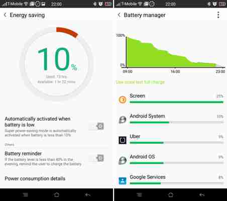

On the plus side, the R7s supports a fast-charging mode provided you use the original charger and cable provided. This lets you replenish 90 percent of the battery in just 50 minutes charging. That’s great, but at the point where my phone switches off because I haven’t been able to get to a charger all day, that’s less useful.
Oppo’s R7s has a lot going in its favor. It’s slim, light and bestows a slightly more premium feeling than its price tag would suggest, due largely to its all metal chassis.
It even runs a custom version of Android in an attempt to stand out from the pack, but unfortunately it’s made sacrifices that leave me wondering exactly who is going to walk into a shop (virtual or actual) and spend $400 on the Oppo. Granted, some of its direct rivals have made similar sacrifices (like the lack of a fingerprint sensor, for example) but if you’re mostly getting the same hardware anyway, I’m again wondering who, outside of its home markets, will be opting for the Oppo.
It’s great value, though strongly challenged in the specs department by the considerably less slimline OnePlus 2, and if great value is enough to sell a phone, these will be flying off the shelves.
Unfortunately, with much of the smartphone market now hinging around ‘bang for your buck’, it’s a message that Oppo will have to shout louder than all of its larger rivals if it wants the R7s to be a hit in the US and Europe.
Ultimately, the Oppo R7s offers an interesting take on Android that will probably suit power users, albeit not ones that require a removable battery in a device, paired with svelte (if not unique) design cues, and that’s all less than $400.
It’s not the obvious choice, but it’s certainly not a bad one either, provided you can live with the distinctly average battery life.
All of Samsung’s 2015 Smart TVs will be powered by Tizen
Samsung’s new SUHD TVs announced at CES today will be powered by it’s new Tizen OS.

The company touts Tizen as bringing a “bevy of new features” to the Smart TV, but also offering “intuitive access.” I’m not so sure that’s true; it seems to be more about having full control over the software experience.
Tizen lets the company do things like allow you to push a single button on Samsung Android devices to carry on watching on your mobile instead. It’s also able to show panes with more information overlaid on sports games or TV shows.
Perhaps the most interesting feature is that Tizen features PlayStation Now integration, so you can stream PlayStation games to your TV without requiring a console.
There isn’t much information yet from Samsung on how Tizen will work or what new features it brings, but one thing’s for sure: it’s going to be on every Smart TV the company makes going forward.
The company has ambitions to have Tizen everywhere , but it’s starting with TVs because that’s easier to target than mobile.
