Not since Steve Jobs pulled the original MacBook Air out of that envelope have we been so impressed and astounded by a new laptop, as we were when we set eyes on the new 12in MacBook. When it announced the MacBook alongside the Apple Watch , Apple said that it was the smallest and lightest laptop that it had ever made, but it’s not until you get one in your hands that you realise what this means.
Thanks to some clever construction there’s barely any depth to the laptop at all, with the thickest part measuring just 13.1mm. Then there’s the weight: just 920g, which is just shy of 300g less than the 11-inch MacBook Air. These measurements add up to mean one thing: you can carry this laptop around with you all day every day and barely even feel it. That’s pretty incredible.
Build quality and design
Getting down to this size hasn’t forced Apple to compromise on build quality either. The chassis, as we’ve come to expect from Apple, is still aluminium, creating an air of strength and lightness, as well as luxury. Apple has finally managed to integrate the wireles antennas into the case, meaning there's no need for the lump of plastic around the hinge, and even though the screen is just 1.8mm thick, the aluminium rear protects it with only the slightest amount of flex. This laptop will survive being carried around practically constantly.
It’s great to see Apple make the new MacBook available in three colours: space grey, silver and gold. It means that you can now match the colour of your computer to your iPhone 6 , iPhone 6 Plus or iPad Air 2 . All of the colours have their own merits, but it’s the gold one that really does it for us.
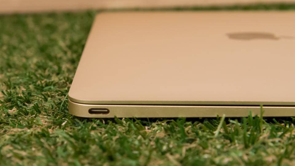
One of the downsides of such a small case is that there’s barely any room for ports. In fact, Apple provides exactly two: a 3.5mm headphone port and the new USB-C. That doesn’t sound like a lot, but USB-C is really clever and is clearly the future for devices such as this. As well a doing all of the things that we’ve come to love about USB, the port also allows the laptop to be charged and works as a video output. The new connector is reversible and smaller than the regular USB-A, which makes it easier to plug in and means that it takes up less space.

That’s the good news. The bad news is that to do a lot of the things you’d want to do, you currently need adaptor cables. With no SD card slot there's no simple way of getting photos off a digital camera, and you won't even be able to use it with Apple's own Thunderbolt Display. Apple sells an adaptor that has one USB C port, so you can keep charging, plus HDMI and standard USB outputs, but it costs a massive £65. Even the basic Apple USB-C to standard USB cable costs £15. If you just buy the USB-C to USB-A adaptor, it means that you have to unplug your computer from mains power just to use a regular USB device. Ideally, two USB-C ports would have been nice, although it’s a struggle to work out where Apple could have put the second port.
Things will improve: more USB-C devices will be available soon and, as it’s an open standard, you’re not limited to using Apple peripherals, so you should be able to get cheaper third-party alternatives.
Keyboard
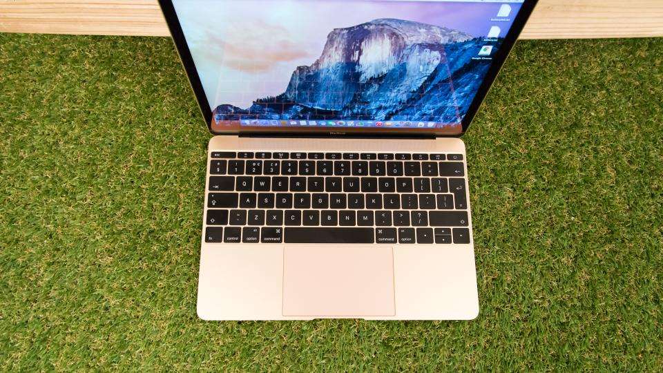
One of the big design issues with the new MacBook was fitting in the keyboard, with traditional models requiring more depth. Apple has ditched the old-style scissor mechanism underneath the keys, lets keys wobble when they’re hit on the edge, in favour of a new butterfly mechanism, which makes the keys more stable and reduces travel. In fact, there’s barely any travel on the keys at all and they move just a fraction when hit.

While the travel has been reduced, the size of the keys has been increased by 40%, with the keyboard stretching from edge to edge. Effectively, you’re getting a full-sized keyboard on a tiny computer. Each key is backlit by an individual LED, so typing in dark rooms isn’t a problem. It’s a weird sensation when you first start typing, as it simply feels different and the lack of travel takes a while to get used to. In this case, different isn’t bad. After using the MacBook for a couple of hours, we soon got used to the way that the new keys work and were typing at full speed in no time. It helps that there’s plenty of feedback, so it’s obvious when you’ve successfully hit a key.
Trackpad
There’s no room for a traditional touchpad either, so Apple has used one of its new Force Touch Trackpads, as introduced with the 13-inch Macbook Pro with Retina Display . This has a haptic feedback engine that uses lateral motion to trick you into thinking you’ve made a physical click, rather than an electronic one. It’s amazingly clever and you’d swear that you were actually clicking it.
It also has four pressure sensors which pick up how hard you’re pressing, so you can use the new Force Touch gestures: you press once for a regular click and then press a little harder to activate a Force Click. It’s surprisingly useful once you start using it, popping up previews in Safari and Finder, for example. There’s an open API for developers to use, so expect Force Touch to become a bigger part of OS X very quickly . A setting within System Preferences lets you adjust the click sensitivity, which is great as you can tighten everything up if you’re pretty forceful when you click.
In general use the glass Touchpad is still one of the best. It’s extremely responsive and its multi-touch gestures, make using the MacBook with OS X 10.10 Yosemite a few steps ahead of any Windows laptop.
